Vlietstra Waterwerken · Brand Guidelines · 2026
Steady as water should be
The brand system for a third-generation firm that keeps the northern provinces dry — built to make sixty years of asset knowledge visible. A fictional client, shown as a working example.
01Overview
The firm
Vlietstra Waterwerken inspects, maintains, and renews pump stations, weirs, and culverts across Friesland and the northern provinces. Founded in 1962, run by the third generation, trusted by the people who work the water every day.
The brand's job is continuity made visible. The firm has always known these assets better than anyone; the identity, the reporting, and the portal put that knowledge in a form a procurement team can score.
02Strategy
Strategy
Mission
Look after the infrastructure others build, for decades at a time.
Positioning
Vlietstra keeps the water where it belongs. Three generations of asset knowledge — now visible in every report, every tender, and the service portal.
Values
- Continuity. Sixty years on the same assets; we plan in decades, not contract terms.
- Vakmanschap. The repair is done right, documented, and explainable to anyone who asks.
- Nabijheid. We are an hour away and we answer the phone.
Who we work with
Waterschap asset managers, municipal project leads, tender boards, and the next generation of crew members.
03Voice & tone
Voice
Quiet authority. Vlietstra speaks when it knows, plainly and without drama — the calm one in the room who has seen this before.
Principles
- Plain. Clear Dutch, short sentences, no jargon the crew wouldn't use.
- Level. Bad news travels in active voice, with the plan attached.
- Evidenced. Numbers where they help; the archive does the persuading.
What we say — and don't
We maintained this gemaal for your predecessor's predecessor.
The pump is fine. The valve is due. Here is what that costs.
An hour away, and we answer the phone.
Startup vocabulary — the firm is 64 years old and should sound like it
Nostalgia — the archive is evidence, never decoration
Superlatives — steady beats spectacular in this market
04Logo
Logo
The mark is the 1962 original redrawn: the three waves of the family sluice, simplified to hold at signage scale and in a 16px favicon. The wordmark sets in the headline face, always in Waterlijn or white.
Clear space & sizing
Clear space equals the height of one wave on all sides. On the fleet, the mark rides the front door panel only.
Misuse
- Do not recolor the mark outside the palette
- Do not set the wordmark in any other face
- Do not add effects, outlines, or shadows
- Do not redraw the waves — use the provided files
05Color
Color
Deep water blues on light ground. Waterlijn carries identity and type; Boezem is the working accent; Signaal appears only where safety demands it.
Accent use
Boezem is the only color that behaves like ink — links, chart lines, and active states. Signaal never decorates; it warns.
06Typography
Typography
Case Grotesque for display, Case Text for reading. Engineered forms with enough warmth for a family firm — set tight, never in all caps.
Steady as water should be
Sixty years on the same assets
Inspection report — gemaal Oosterdijk
The pump is fine. The valve is due. Here is what that costs, and when we would do the work.
Kunstwerk 214-B · Wetterskip De Marren · May 2026
Rules of thumb
- Never set type in all caps — signage included
- Data tables are typography: same scale, same discipline
- Dutch first; English follows the same scale
Case by Fontsmith — licensed for web and print.
07Layout & grid
Layout & grid
Documents and the website share one strict grid: generous margins, a fixed reading measure, and tables treated as first-class design objects. If a report looks like it was measured, it was.
08Photography
Photography
The assets and the land, photographed straight. Wide polder horizons, working infrastructure, natural light — the honesty of a survey photograph with the care of an editorial one. No stock, no drama, no filters.
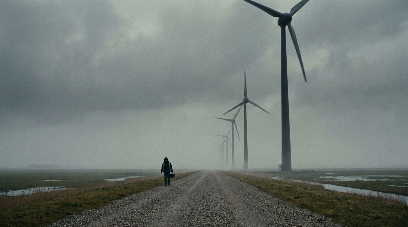
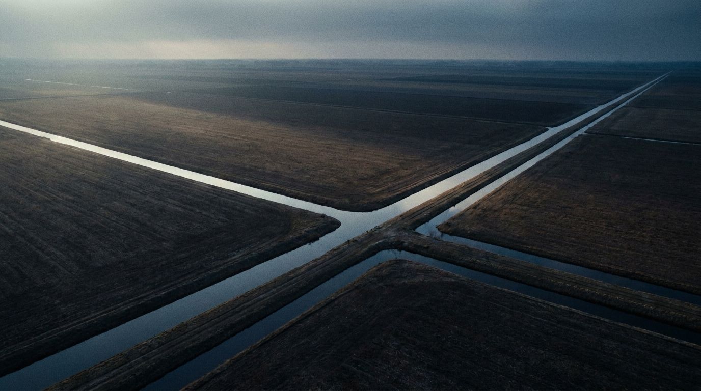
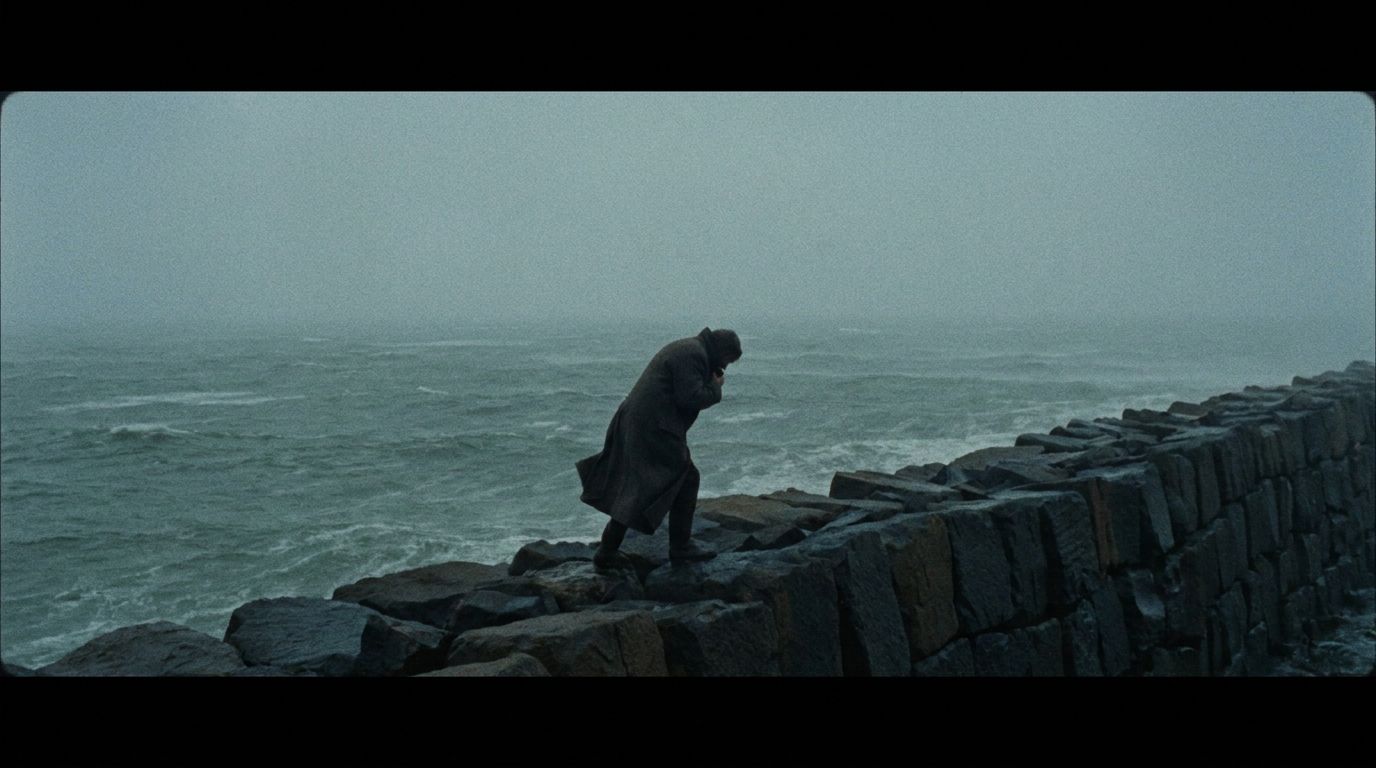
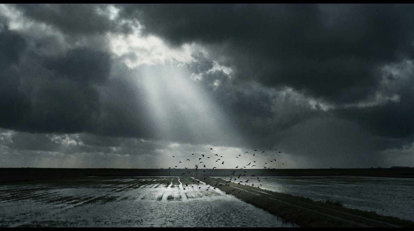
- Shoot straight-on or wide; never tilted
- Natural light only — overcast is the house weather
- People appear working, never posing
09Motion
Motion
Calm and physical. Interfaces fade and settle; nothing bounces. Data draws in at reading speed — the portal should feel like water finding level, 200ms, ease-out.
10Components
Components
The portal and the website share one kit: quiet fields, hairline tables, and a single accent. Status is a word with a dot, never a traffic light.
Buttons & links
Badges
Card
Gemaal Oosterdijk
Inspected May 21 · pump nominal · valve replacement advised Q3.
Form
Icons
11Do & don't
In short
- Lead with the asset and its history
- Show the numbers; they are the brand
- Keep Boezem for links and data only
- Write like the crews talk, cleaned up
- No stock photography, ever
- No all caps, no exclamation marks
- No Signaal orange outside safety contexts
- No nostalgia — the archive is evidence
Vlietstra Waterwerken — Brand Guidelines · v1.0 · A fictional example client