Noord Brand Guidelines · 2026
Noord
How Noord looks, sounds, and behaves. One quiet, monochrome system — the mark, the type, the grid, and the voice that carry everything we do.
01Overview
True north
Noord helps good companies find their north — and grow without growing heavier. We pair patient capital with hands-on craft: strategy-led brand, product, and the marketing systems that let a lean team perform like a larger one. Human-first, AI-enabled — people set the foundation right, so AI can genuinely scale it.
The brand works the way we do: patient, precise, and quietly confident. It would rather show the work than talk about it — whitespace, weight, and spacing do the talking, and nothing announces itself. Noord signs its work under two names, Ventures and Studio, covered at the end of this document.
02Strategy
What we believe
Most companies don't need to be louder. They need to be clearer, and to do more with what they already have. Noord exists to make that possible — through capital, craft, and the careful use of AI.
Mission
Help good companies grow without growing heavier.
Positioning
Quiet competence. We would rather show the work than talk about it. We take on a small number of partners and go deep, working inside the business rather than presenting to it from the outside.
Values
- Restraint. We cut before we add. The strongest version of anything is usually the quieter one.
- Craft. Details are not decoration. They are how trust is earned.
- Leverage. We build systems that let a small team carry a large weight.
- Candour.We say what is true, including “we don't know yet.”
Who we work with
Established companies in the Netherlands that are convinced about AI and want to scale the business they have while staying lean. People who value judgement over volume, and who would rather have one senior partner than a large agency.
03Voice & tone
How we sound
Understated, humble, trustworthy. We never shout. The voice is the same across both entities.
Principles
- Understated.State what's true and let it stand. No superlatives we can't back up.
- Plain. Short words, concrete nouns. If a simpler word exists, use it.
- Considered. Every line earns its place. Read it back and cut a third.
- Warm. Human and direct — never so relaxed that it reads careless.
What we say — and don't
“We help you do more with the team you have.”
“Three weeks. Here's what changes.”
“We don't know yet — we'll find out.”
“Game-changing, revolutionary growth.”
“Unlock 10x synergy at scale!”
“World-class, best-in-breed solutions.”
Naming
Noord on its own refers to the whole. Use Noord Ventures and Noord Studio when the entity matters; noord.vc and noord.devas their domains. “Studio Noord” appears in some legal and product contexts and is acceptable, but “Noord Studio” is preferred going forward. Never “NOORD” in all caps in running text.
04Logo
The mark
The mark is a geometric N built from facets — a northern peak, a compass point. It is drawn in a single ink weight and uses currentColor, so it inherits whatever text color surrounds it.
Clear space & sizing
Keep clear space around the mark equal to the height of one facet. The mark stays legible down to 16px; below that, lean on the favicon (mark on an ink tile). Don't reproduce it smaller than 14px in print.
Minimum clear space = one facet height on all sides.
Misuse
- Don't recolor the mark outside the palette.
- Don't add effects — shadows, gradients, outlines.
- Don't rotate, stretch, or rebuild it.
- Don't place it on a busy image without a clear field.
The Noord mark was drawn by Li-Anne Dias.
05Color
Palette
Monochromatic on warm paper. Ink, beige, and one gray between them — nothing else. There is no accent color: emphasis comes from weight, size, and spacing, never from hue. What little contrast exists carries all the meaning.
LightNo accent color
Links, active states, and emphasis are ink — set apart by weight, underline, or position, not by hue. If something needs to stand out, give it space or make it heavier. Never reach for color.
06Typography
Type
One typeface: Messina Sans ('Messina Sans', -apple-system, system-ui), set at weight 500 for running text. It reads cleanly at every size and stays out of the way. We set it tight — negative tracking on headings — and give it room. Hierarchy comes from size and weight.
The sea is above us, and still we sleep.
Land we borrowed from the water.
The pumps run all night so we don't have to pray.
Fog takes the village; the church bell stays.
We live below the waterline and speak softly about it, trusting the dyke the way our grandparents trusted God — daily, and without discussion.
NAP −2.1 m · below the waterline
Rules of thumb
- Headings: weight 600, tracking −0.02 to −0.03em, balanced wrapping.
- Body: weight 500, line-height 1.6, ~66 characters.
- Never all caps — labels and eyebrows are sentence case, set apart by size and weight.
- Numerals and code may use a monospace stack for tables.
Messina Sans is designed by Luzi Gantenbein and published by Luzi Type, Zürich. Licensed for Noord Ventures and Noord Studio.
07Layout & grid
The grid
A faint vertical grid (≈204px columns) runs behind every page — present but barely there, like ruling on good paper. Content sits in a single reading column of ~592px. A 184px gutter on the left holds navigation and labels. Dividers are hairlines; corners are softly rounded (4–6px). Whitespace does the heavy lifting.
08Photography
The polder, plainly
Photography is documentary and unstaged: real people, real places, natural light. We treat images with a slight desaturation and a touch of contrast so they sit calmly next to the paper. Avoid stock clichés, glossy renders, and anything that feels performed.
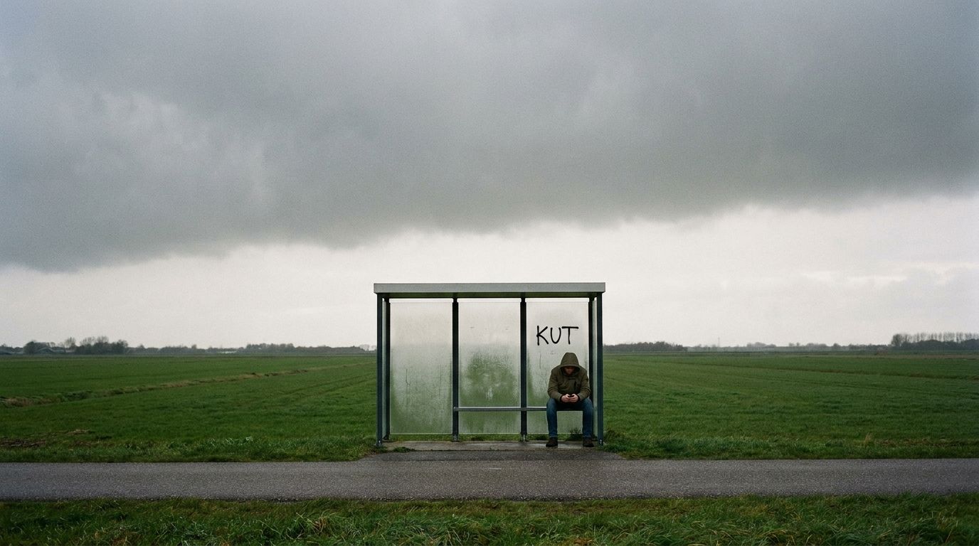
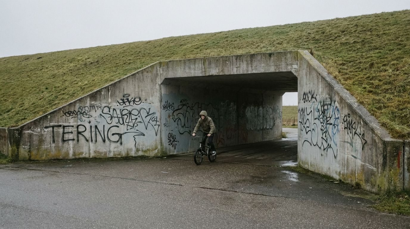
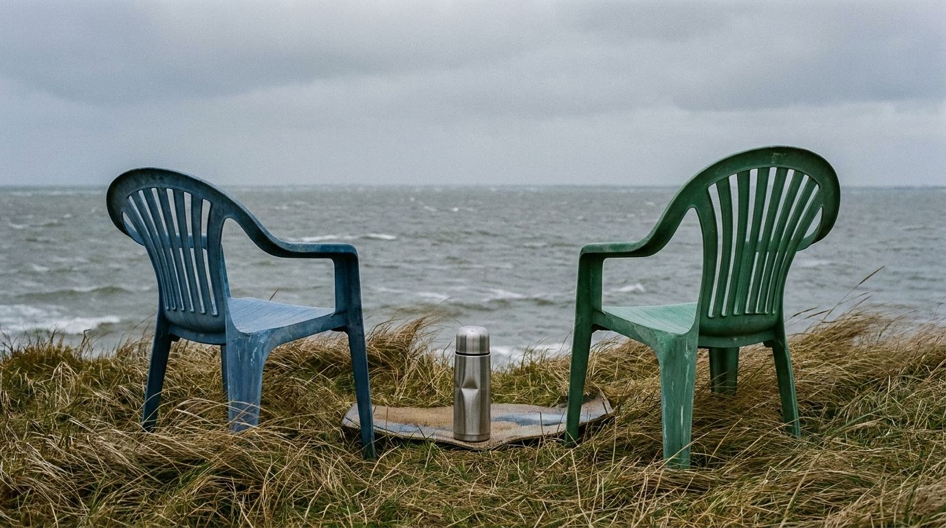
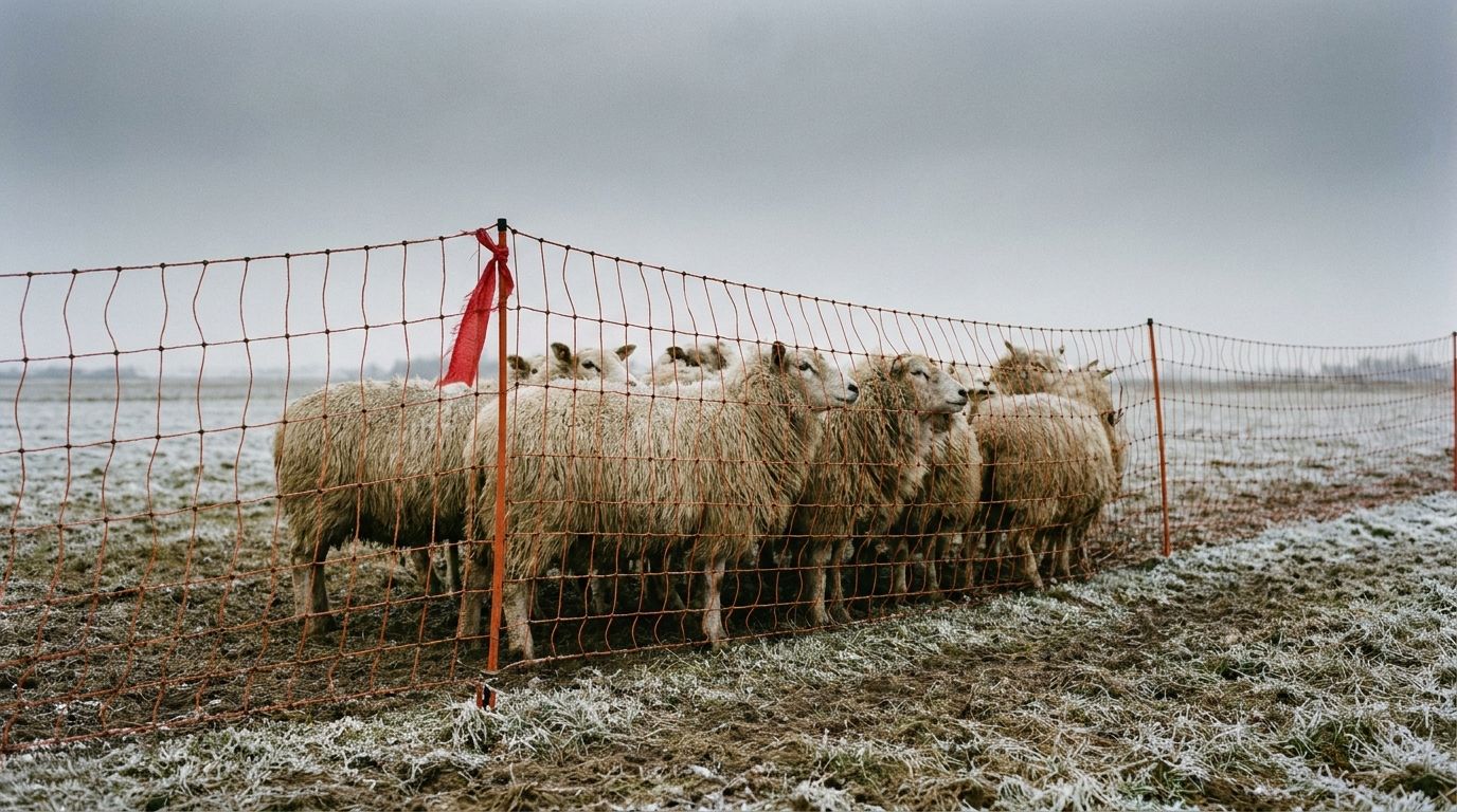
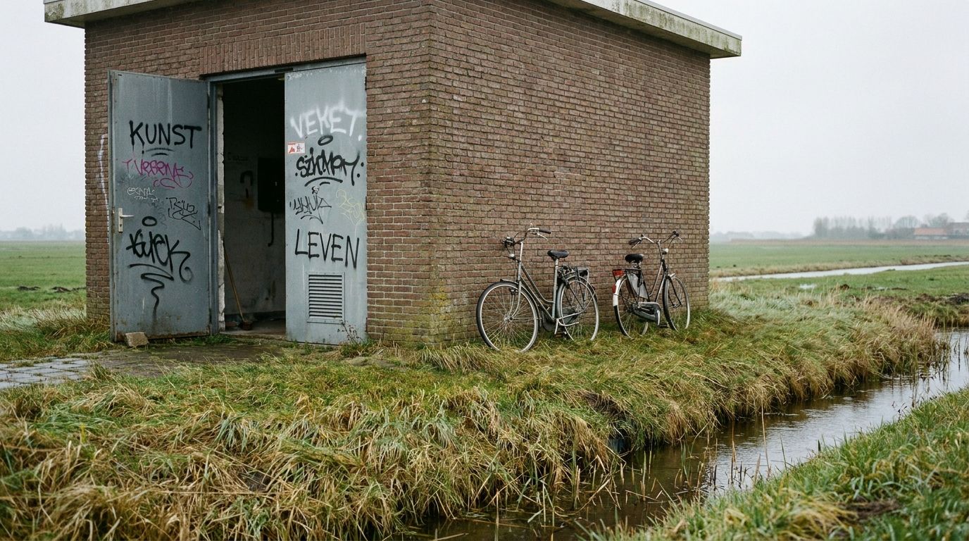
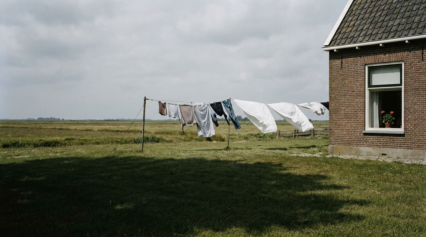
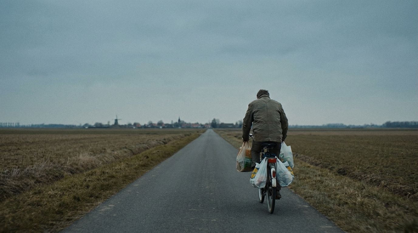
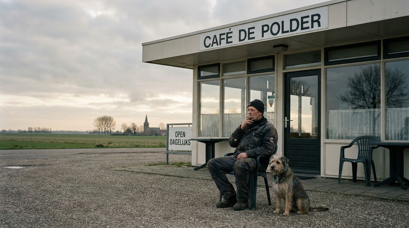
- Desaturate slightly (≈0.85–0.9) for cohesion.
- Full-bleed within the column; softly rounded corners.
- People over product; place over abstraction.
09Environment
Out in the world
The system holds at every size and on every surface — the same mark, the same restraint, from a conference display to a chest print. Nothing is redesigned per context; only scale and material change.
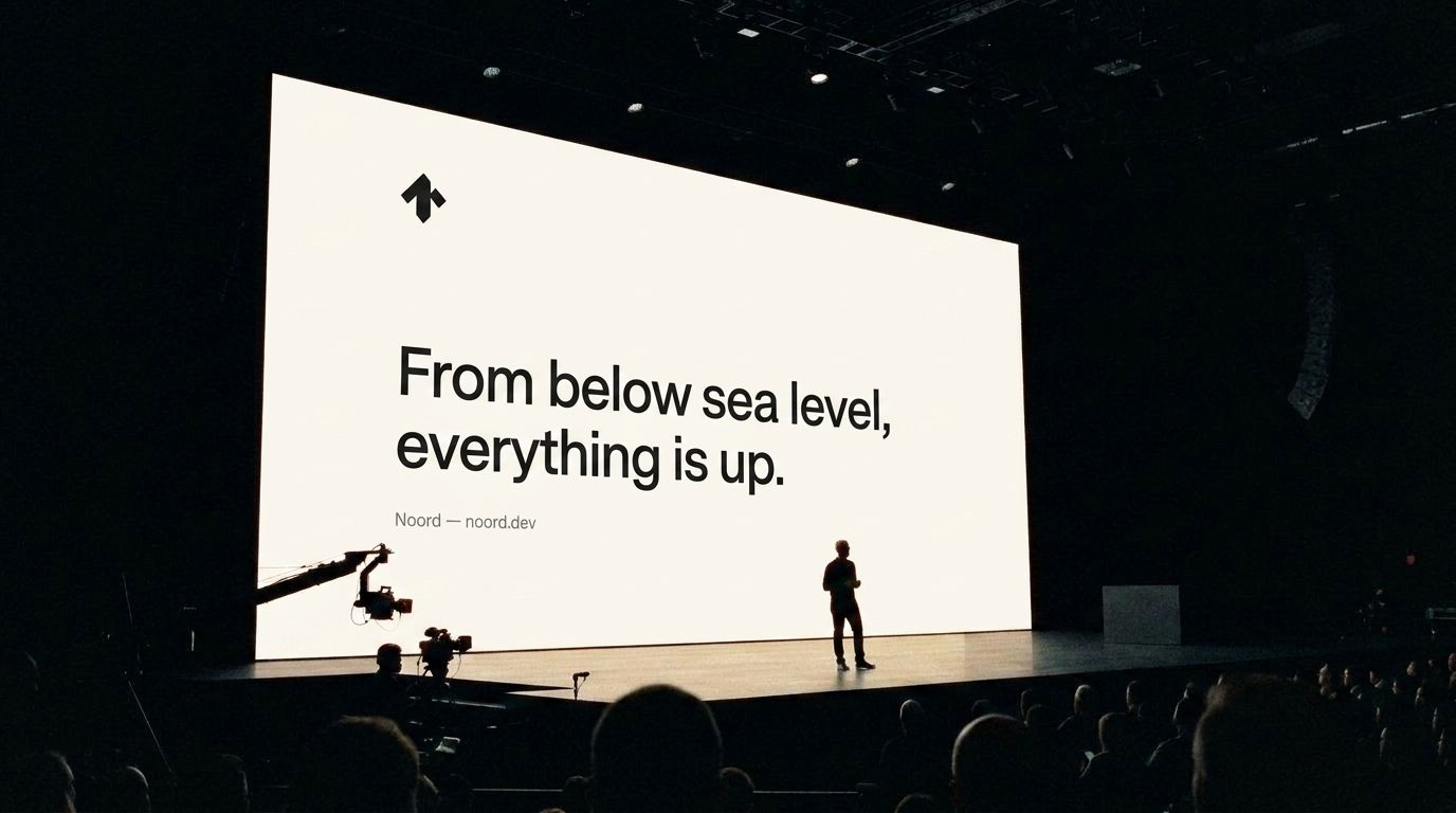 Large screens
Slides and displays carry typography and the mark only, all left aligned. One line per slide; whitespace does the rest.
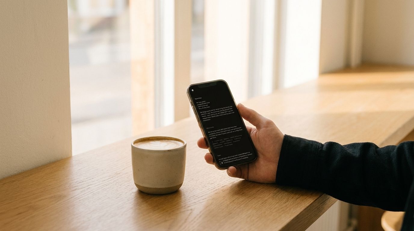 Small screens
The noord.dev homepage on the mobile grid: a single column, type stepped down, spacing held. The mark stays legible to 16px.
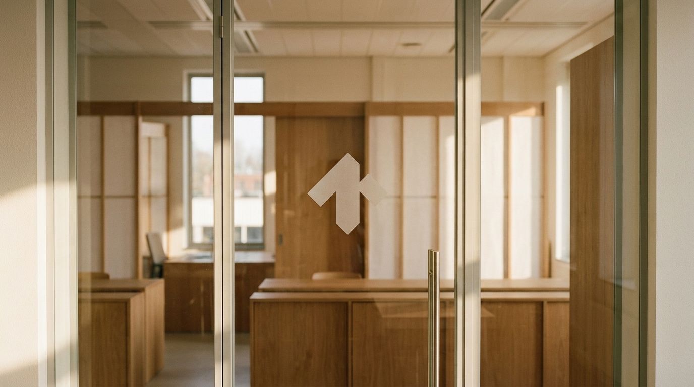 Outside
Signage is the mark on an ink panel — or ink on paper. One material, one color, no effects; legible at distance.
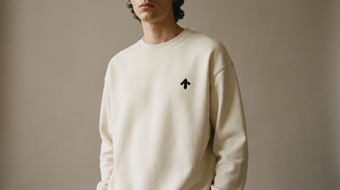 Merch
MerchEmbroidered or printed in one color — ink on light gear, bone on dark. The mark sits small on the chest, never across the back.
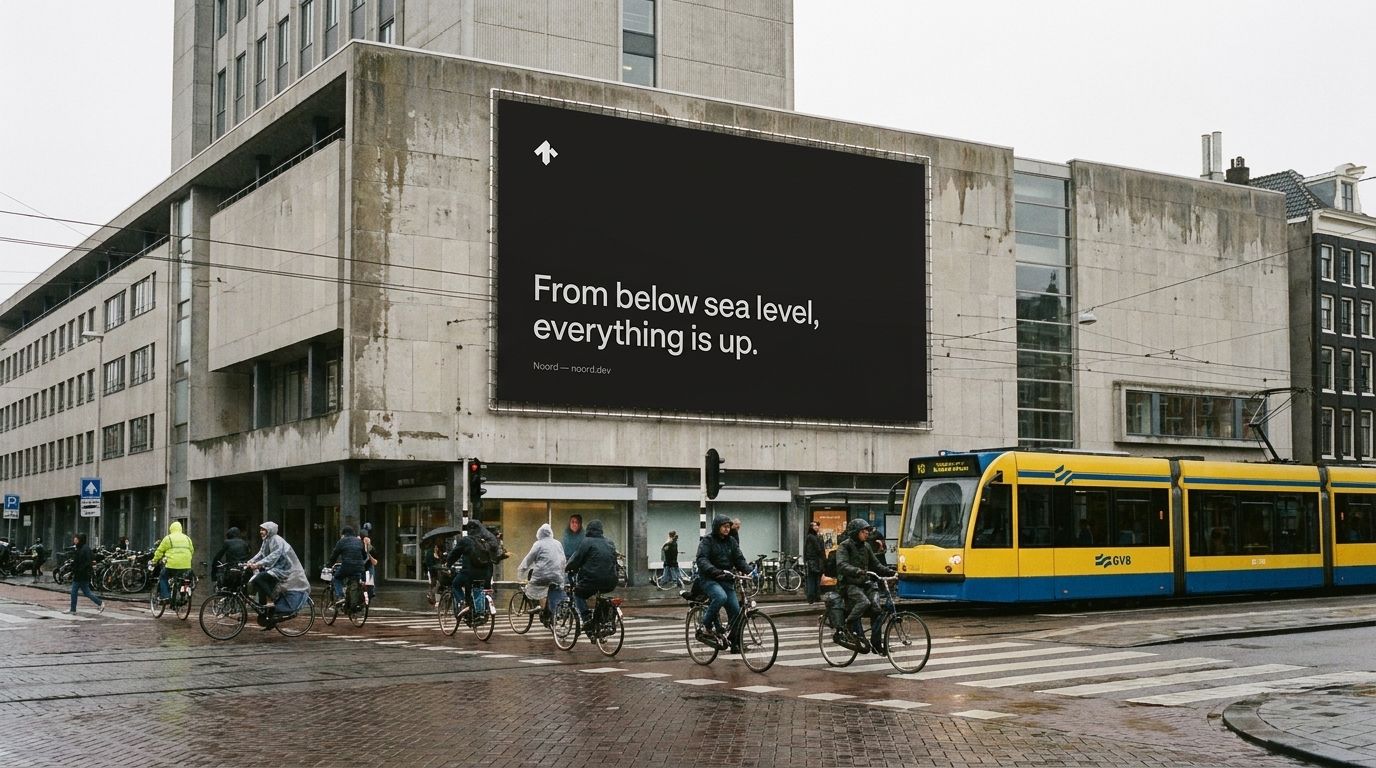 Billboards
One line, the mark, and room to breathe — the slide layout at roadside scale. If it can't be read at 80 km/h, it says too much.
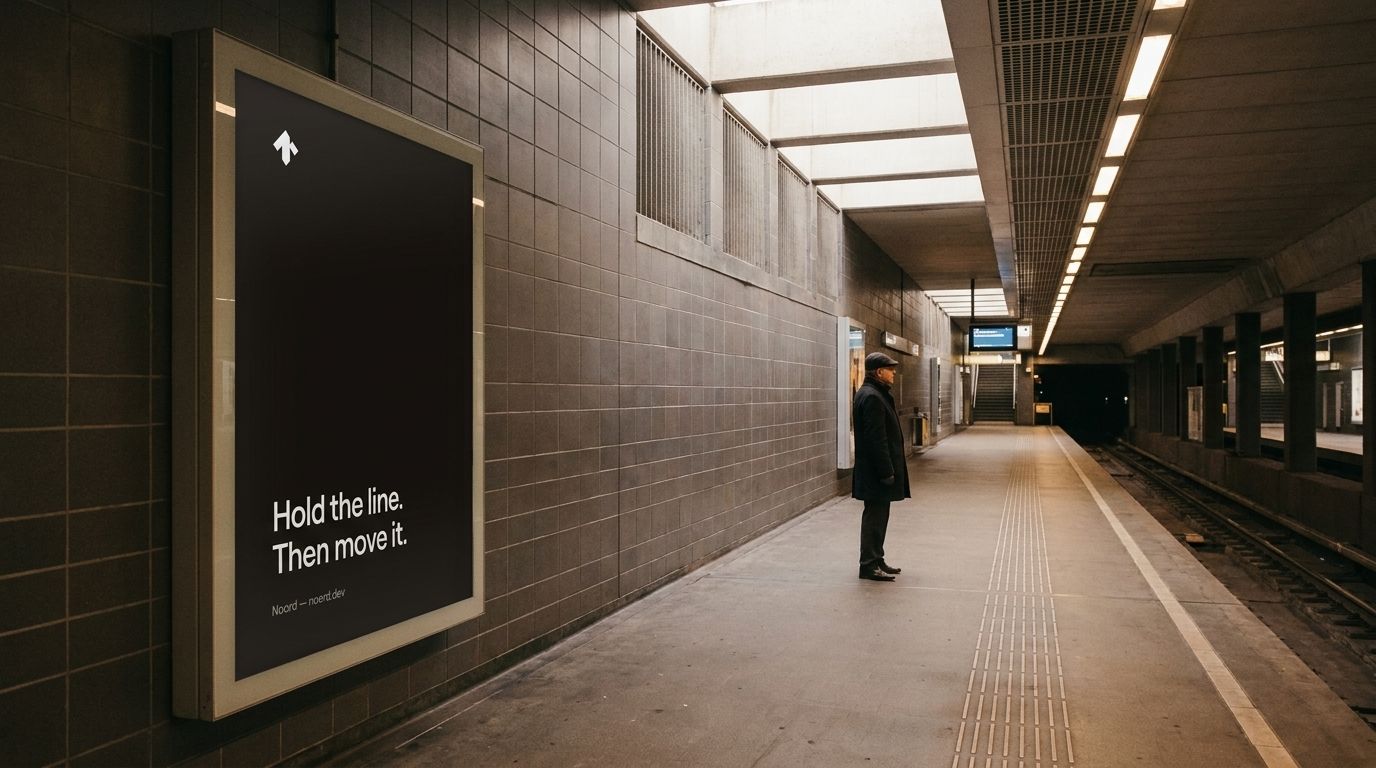 Subway ads
The portrait ad on a backlit panel: paper ground, one claim, the mark small. It competes by being the quietest thing on the platform.
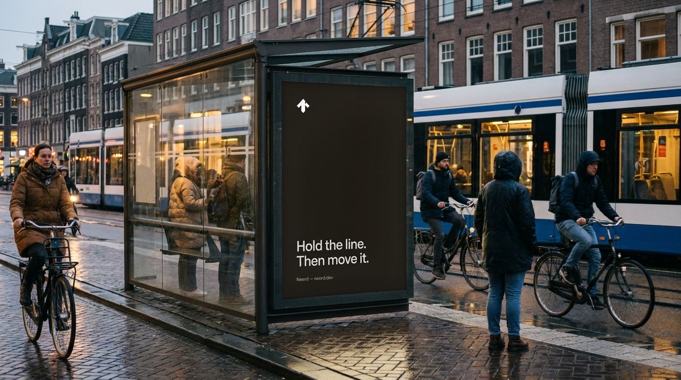 Bus stop ads
The same portrait creative in the abri frame, unchanged behind wet glass. One system, every format.
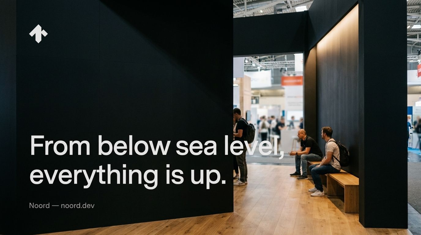 Conference presence
A booth is a slide you stand in front of: the mark, one sentence-case line, and an oak counter. Nothing else on the wall.
10Motion
Short and eased
Motion stays out of the way. Transitions are short (0.15–0.3s) and eased. Color and opacity change; layout rarely moves. Theme switches cross-fade. Nothing bounces, nothing announces itself.
11Components
The working parts
A small kit, used consistently. Solid ink buttons for primary actions; weight and underline for links and live state; hairline borders for everything that contains.
Buttons & links
Badges
Card
Design systems
A single source of truth for type, color, and components — so everything you ship stays on-brand without a designer in the loop.
Form
Icons
RasterThe Noord design system, live and resizable, and the full interface kit, documented.
12E-mail signature
Signatures
The signature is text-only — no images, no banners, no quotes. Name in ink, role and city in gray, the entity with its domain in ink above a hairline. It renders identically in every mail client because there is nothing in it that can break.
Usage
- Fill in your name and role, then Copy signature and paste it into your mail client's signature settings (Gmail: Settings → Signature; Apple Mail: Settings → Signatures). Formatting is preserved.
- Use the Ventures signature on noord.vc addresses, Studio on noord.dev.
- Don't add logos, images, legal footers, or pronoun-length disclaimers.
13Two names
Ventures & Studio, side by side
Noord signs its work under two names. Noord Ventures (noord.vc) is the investment company; Noord Studio (noord.dev) is the services firm. Both use this system unchanged — the same mark, palette, type, grid, and voice. What differs is the name the work is signed with, the domain it lives on, and the kind of work it signs.
The investment company. Patient capital, hands-on partnership.
- Name: Noord Ventures
- Domain: noord.vc
- Signs: investments, partnerships
- Identity: the shared system
The services firm. AI-native services, built on design.
- Name: Noord Studio
- Domain: noord.dev
- Signs: client work, product
- Identity: the shared system
14Do & don't
In short
- Let whitespace carry the page.
- Let weight and spacing carry emphasis.
- Write less, then cut more.
- Round corners subtly (4–6px); keep lines hairline.
- Show the work; skip the adjectives.
- Introduce color — the system is monochrome.
- Set anything in all caps.
- Add shadows, gradients, or glow.
- Reach for hype or superlatives.
- Introduce a second typeface.
- Make motion the main event.
Noord Brand Guidelines · 2026 · Internal reference