Brand Guidelines Template · 2026
Every brand starts from this shape
The master template behind every Noord-built brand system. Each section below is a placeholder — the structure, the components, and the order are the deliverable; the client supplies the content.
01Overview
The brand
Two or three paragraphs that say what the company is, who it serves, and why it exists — written the way the founders would say it across a table, then edited until nothing performs.
The overview sets the register for everything that follows. If a sentence here wouldn't survive being read aloud in a client meeting, it doesn't survive here.
02Strategy
Strategy
Mission
The change the company exists to make, in one line.
Positioning
One sentence that places the brand: who it's for, what it does, and the difference that makes it the obvious choice.
Values
- First value. One sentence on what this value means in practice — a behavior, never a platitude.
- Second value. Values earn their place by excluding something; say what this one rules out.
- Third value. Three is usually enough. A value nobody would ever reverse isn't a value.
Who we work with
The two or three audiences that matter, named specifically enough that the photography and tone sections can point back at them.
03Voice & tone
Voice
How the brand sounds — one register, held everywhere from the homepage to a support reply.
Principles
- Plain. Short sentences, concrete words, no jargon the reader has to translate.
- Level. Good and bad news in the same calm voice; confidence never needs volume.
- Specific. Numbers, names, and examples over adjectives.
What we say — and don't
An example sentence in the brand's actual voice.
A second one, showing how it handles a claim.
A third, showing how it handles bad news.
The vocabulary this brand never uses
Superlatives and exclamation marks
Anything the reader has heard a hundred times
04Logo
Logo
The mark and the wordmark, where each is used, and the files to use them from. The Acme wordmark stands in here — the client's mark takes its place, with its own construction note.
Clear space & sizing
Define clear space in units of the mark itself — a wave, a letter height — so it scales with use.
Misuse
- Do not recolor the mark outside the palette
- Do not stretch, rotate, or add effects
- Do not set the wordmark in another face
- Do not redraw it — use the provided files
Credit the mark's designer here, with a link.
05Color
Color
The template ships in process color — cyan, magenta, yellow, key — so every swatch is visibly a placeholder. The client's palette replaces it one-for-one: a working accent, grounds, ink, and a note on what each color is for.
Accent use
One color behaves like ink and does the interactive work; the others earn their appearances. Name the rule for the client's palette here.
06Typography
Typography
One family, few weights, a fixed scale. The samples below describe themselves — replace them with lines in the client's voice, set in the client's licensed face.
The display size carries one idea
A display line, and nothing beside it
Titles hold sections together
Subheads do quiet structural work
Body text is the brand most people actually meet — a comfortable measure, a steady rhythm, and no tricks. Everything else exists to bring readers here.
Labels · metadata · captions · 12px
Rules of thumb
- State the caps rule — most brands here never set all caps
- Fix the scale; add width to the page, never to the paragraph
- Name the fallback stack for email and documents
Credit the typeface and foundry here, with a link to the license.
07Layout & grid
Layout & grid
The structural rules every surface shares: the module, the gutters, the reading measure, and how boxes sit on the grid. Keep this section even for print-only brands — the discipline is the point.
08Photography
Photography
The art direction in two or three sentences: what gets photographed, in what light, from what distance — written so a photographer the brand has never met could shoot a usable set. The plates below hold the place of the client's photography.
- State the light rule (natural, overcast, hard flash — pick one)
- State the people rule (working, never posing, or none at all)
- State what is banned (stock, filters, tilted horizons)
09Environment
Out in the world
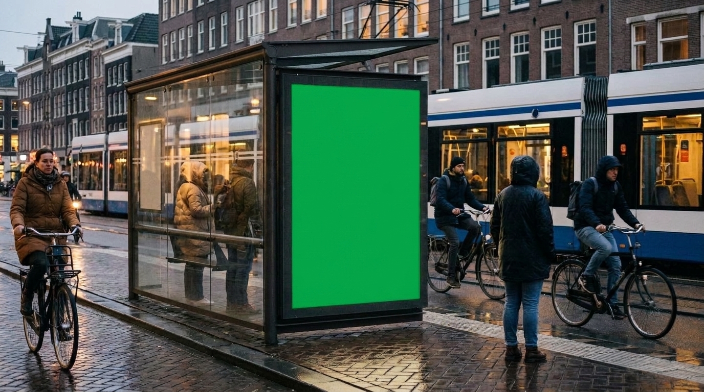
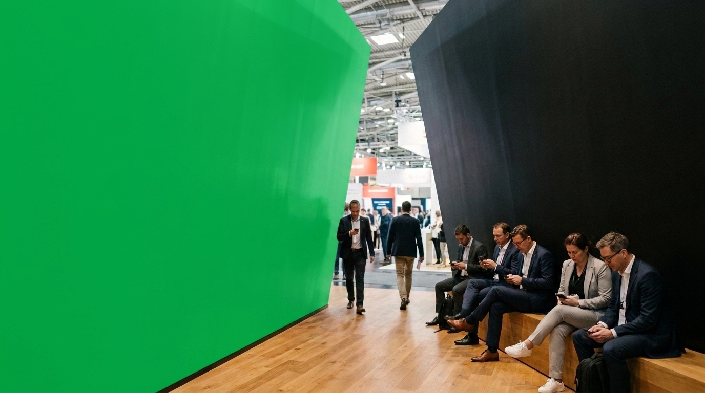
The same eight contexts every system is tested against. The green panels are exactly that — chroma surfaces where the client's artwork composites in, so one photo set serves every brand.
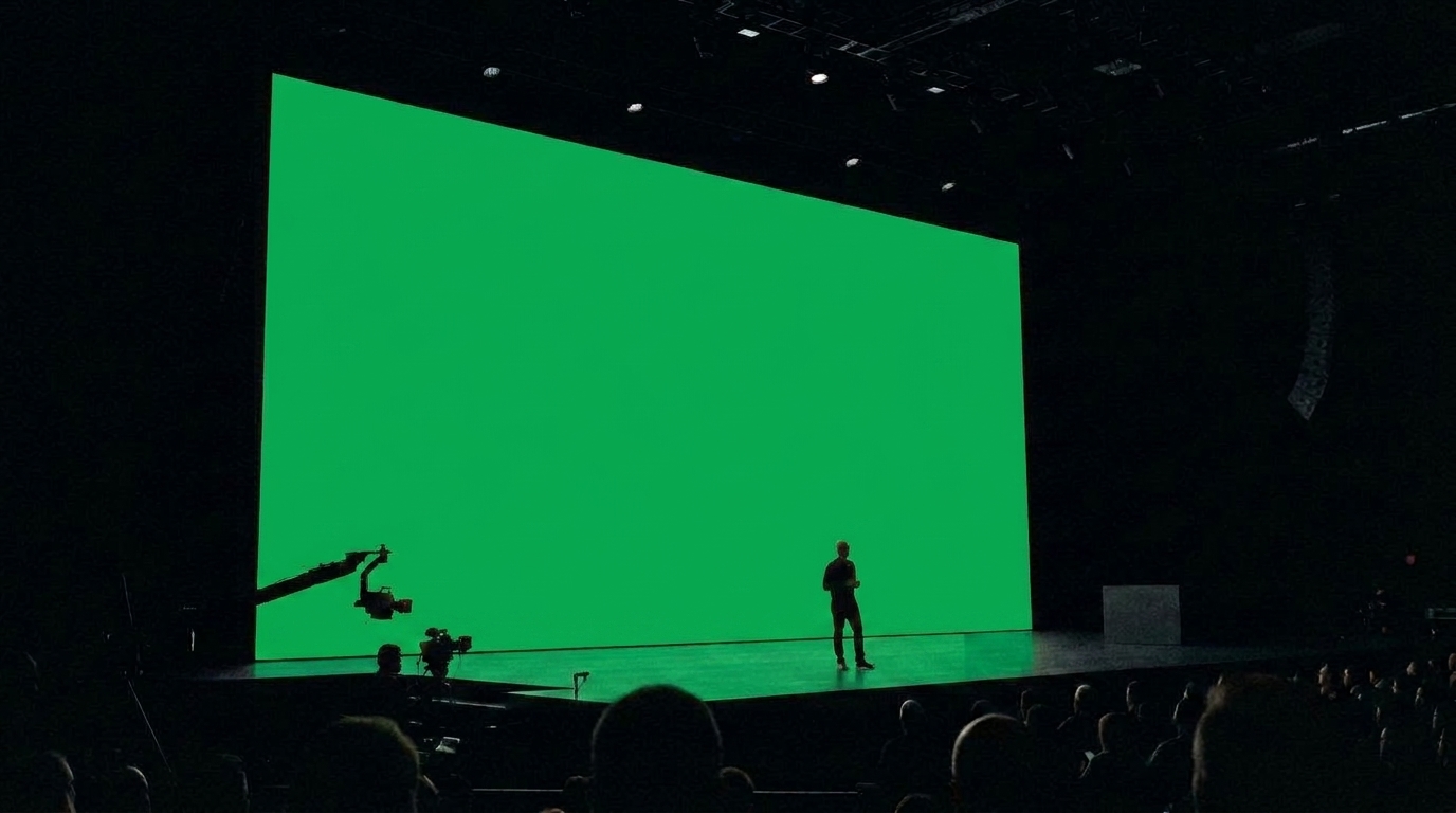 Large screens
A keynote or lobby display. The green area takes the client's slide — logo and one line, left aligned.
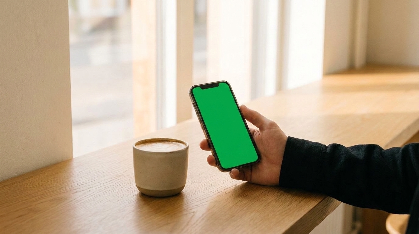 Small screens
The brand at phone scale in a real hand. The green display takes a homepage or app screen.
 Outside
Glass-door signage. The green panel takes the mark, centered, in vinyl scale.
 Merch
MerchApparel and objects. The green print area takes the mark or a single line, following the fabric.
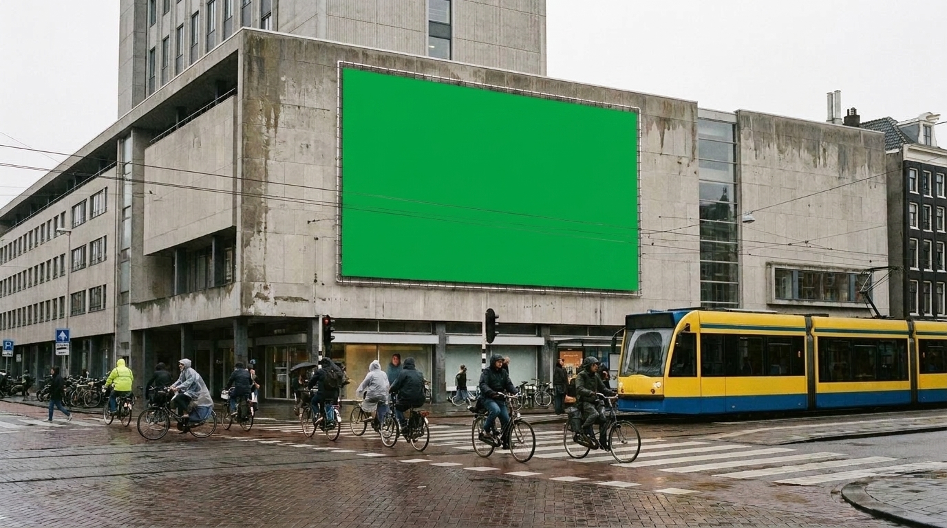 Billboards
Out-of-home at road scale. The green face takes one headline and the mark — nothing else survives at 80 km/h.
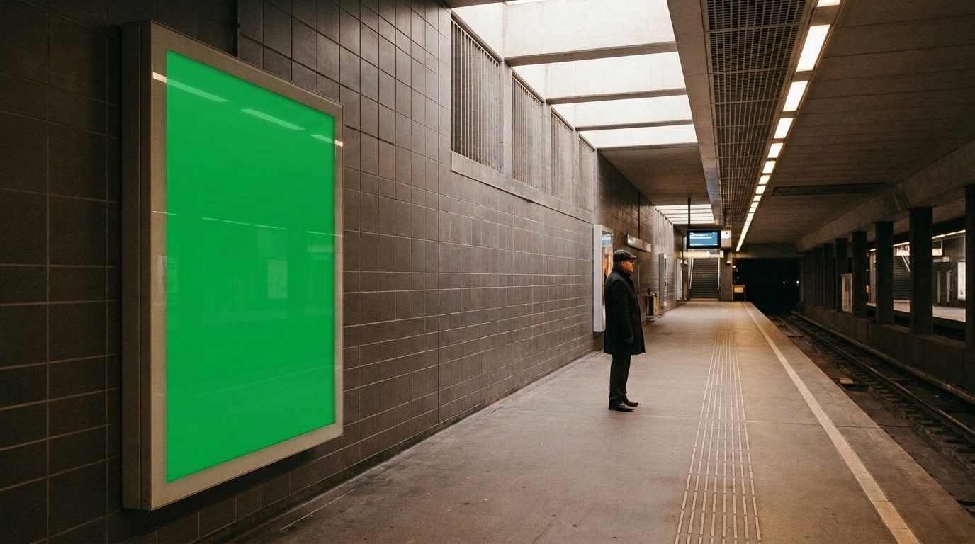 Subway ads
Platform posters read at close range. The green face takes a longer line set at reading scale.
 Bus stop ads
The abri format, behind glass. The green face takes the same system as the billboard, one size down.
 Conference presence
An immersive booth. The green wall takes large typography that follows the architecture.
10Motion
Motion
How the brand moves: the duration, the easing, and the one-sentence character note — calm and physical, quick and precise, whatever the brand is. Nothing here should need a video to explain.
11Components
Components
The interface kit in the brand's clothes: buttons, fields, tables, and one worked card example so engineers inherit decisions instead of making them.
Buttons & links
Badges
Card
A worked example
One realistic card, filled with the client's actual content — never lorem ipsum.
Form
Icons
12Two names
Expressions
How the brand flexes across named surfaces or sub-brands, if it has them — same identity, different jobs. Delete this section for single-surface brands.
The primary expression — the company as the market meets it.
- The website and product
- Sales and tenders
- The fleet and signage
A second expression sharing the same visual system under its own name.
- Research publications
- Events and talks
- Early-access releases
13Do & don't
In short
- Keep every rule falsifiable — someone must be able to break it
- Show one worked example per rule
- Write for the person who joins after you leave
- Date the system and note what changed
- No rule without a reason attached
- No lorem ipsum anywhere in the final system
- No section kept empty for ceremony — delete it
- No PDF as the only home; the system lives where the work does
Brand Guidelines Template · v1.0 · The master every client system starts from