Reference · Working reference · Noord
Noord brand guidelines
Logo, color, typography, grid and visual examples from Noord’s brand system.
Download this method as MarkdownWhat it is for
The identity should help you recognize the work without getting in its way. At Noord, that means a clear page, careful type, and enough room to look at the image or decision in front of you.
This is the system we use, with the actual colors, typography, photographs, and applications below. Use those details when making something for Noord. The explanations are here so you can understand the choices, not just copy the appearance.
- For
- Designers working with Noord
- Use when
- You need to apply Noord’s identity, not invent a new one.
- Bring
- The current approved identity and the medium you are designing for.
- Leave with
- A deliverable that follows the lab’s identity.
A worked example
Fictional example
A research report uses the same type hierarchy and neutral colors as its accompanying interface; status is communicated with labels, not color alone.
Check the result
Check the actual approved tokens and artwork before export.
What this leaves open
The visual examples illustrate the system; confirm font and asset licenses before reusing source files.
Tools, in order
Here is where each tool helps. Use an equivalent you already work with if it fits the task and your project’s access requirements.
Before designing
A versioned project folder
Take the current Noord identity as the source. Select only the rules needed for this medium, including approved fonts and image rights.
Carry forward A short, source-linked identity brief.
While making
FigmaA coding workspace with approved file accessClaude, ChatGPT, or Grok
Supply those rules with a real piece of content. Ask for an application of the identity, not a new identity. Inspect type, grid, tone, and imagery in the actual output.
Carry forward A versioned application with the source values intact.
Before sharing
Browser and accessibility checksA versioned project folder
Check both themes, real content lengths, and the exported files. Compare against the guideline rather than relying on the assistant's description.
Carry forward A checked preview and a short list of intentional exceptions.
Review the work with partners
We make and revise the work with Claude, ChatGPT, or Grok, then put selected versions on our Studio project pages for partners to review. Check the preview before sharing it. You can do the same with a private prototype or shared document; use a workspace that can access the files you need.
Name the version, say what changed, and ask the question you need answered. Keep feedback with that version and discuss conflicting requests before making the next changes. Confirm approval separately, and keep confidential work in a restricted space.
A question for this review
Where does this application depart from the approved identity, and is that exception justified?
Delegate the routine work
Check supplied values, find inconsistent names, or prepare a list of deviations from the reference.
Changing Noord's identity or approving an exception needs the identity owner.
How to use it
- Noord is an applied design lab building interfaces that bring human judgment into visual model training.
- Use plain language, sentence case, clear hierarchy and a restrained palette. Interface structure should support the work rather than compete with it.
- Preserve readable line lengths and accessible contrast in both themes. Reserve interaction for things people can act on.
The brand system
The shared brand system for Noord, Vlak, Polder, Bureau and Studio.
Noord brand guidelines · 2026
Noord core brand guidelines
Noord, Vlak, Polder, Bureau and Studio. Noord is the core brand. Vlak, Polder, Bureau and Studio are sub-brands with individual guidelines and a shared foundation. Applied design lab. Alkmaar, the Netherlands.
01Overview
Applied design lab
We build interfaces that drive visual model training at scale. People see things machines miss: a subtle difference, an unexpected pattern, a detail that changes the meaning of an image. We design ways to bring that judgment into the training process.
We focus on the work between an image and a better model: looking, comparing, correcting and deciding. Our tools make these actions useful to people and turn their judgment into clear examples for machines. Expert knowledge becomes a practical foundation for visual learning at scale.
The interface should give you room to look. A photograph needs enough detail to compare; a label needs to make sense without an explanation; a correction needs to be easy to make. The type, spacing, and controls serve those tasks.
02Strategy
Human judgment, made useful
Better visual learning depends on the quality of the examples and decisions behind it. Interface design shapes how people inspect an image, express uncertainty, compare alternatives and correct a result. That is the work of the lab.
Mission
Make expert knowledge a practical foundation for visual learning at scale.
Positioning
Noord is an applied design lab building interfaces for visual model training. We connect careful human observation with structured examples that machines can learn from, through tools, working systems and partner work.
Values
- Judgment. Design for what people can see and understand. Keep ambiguity visible instead of forcing a false answer.
- Craft. Precision in interaction and presentation helps people make better decisions. Aesthetic quality serves the work.
- Restraint. Keep interfaces lightweight. Remove friction and decoration that compete with the task.
- Candor. Distinguish demonstrated results from hypotheses and work in progress. Do not imply model improvements without evidence.
Who we work with
Teams building visual learning systems, and domain experts whose observations are essential to them. We work with partners who need better ways to inspect, compare, annotate and review visual material—not simply more labels.
03Voice & tone
How we sound
Say what the work does and why a choice matters. Write as you would explain it to a thoughtful partner: directly, with enough detail to follow the reasoning. Use an example when an adjective would leave the meaning open.
Principles
- Understated. State what's true and let it stand. No superlatives we can't back up.
- Plain. Short words, concrete nouns. If a simpler word exists, use it.
- Considered. Every line earns its place. Read it back and cut a third.
- Warm. Human and direct, never so relaxed that it reads careless.
What we say — and don't
“We build interfaces that drive visual model training at scale.”
“People see things machines miss.”
“This is in development. Here is what we have tested.”
“Game-changing, revolutionary growth.”
“Unlock 10x synergy at scale!”
“World-class, best-in-breed solutions.”
Naming
Noord is the applied design lab. Vlak is the minimalist agentic design system. Polder provides open models for ai-native design process. Bureau brings humans and agents into one place. Studio is the fifth family identity; its product descriptor is still to be defined. Preserve the names and use sentence case. Use Noord.dev as the email sender name.
04Logo
Five marks, one family
Use the selected family in this order: Noord, Vlak, Polder, Bureau and Studio. The marks share 45° diagonals, solid fills and sharp ends. Preserve each orientation and use the supplied assets. Polder uses P1; Bureau retains its approved quarter-turn; Studio uses the final shallow-indent S.
Selected geometry: Noord original; Vlak reflected vertically; Polder P1 with a full-height spine; Bureau rotated 90° clockwise from Noord; Studio with balanced diagonals and two shallow indents.





Clear space & sizing
Recommended family clear space: at least one quarter of the mark width on every side. Start at 24px for standalone use. Review smaller sizes on the actual background. Keep the five marks on equal display canvases.
Misuse
- Do not stretch, round, outline or add new cuts to the symbols.
- Do not use earlier explorations as alternate brand assets.
- Keep the family monochrome; do not assign a colour to each identity.
The Noord mark was drawn by Li-Anne Dias.
05Color
Palette
Monochromatic on warm paper. Ink, beige, and one gray between them. Nothing else. There is no accent color: emphasis comes from weight, size, and spacing, never from hue. What little contrast exists carries all the meaning.
Accent use
There is no accent color. Links, active states, and emphasis are ink, set apart by weight, underline, or position, not by hue. If something needs to stand out, give it space or make it heavier. Never reach for color.
06Typography
Type
One typeface: Messina Sans, with the native system sans as fallback. It reads cleanly at every size and stays out of the way. We set it tight, with negative tracking on headings, and give it room. Hierarchy comes from size and weight.
The sea is above us, and still we sleep.
Land we borrowed from the water.
The pumps run all night so we don't have to pray.
Fog takes the village; the church bell stays.
We live below the waterline and speak softly about it, trusting the dyke the way our grandparents trusted God — daily, and without discussion.
NAP −2.1 m · below the waterline
Rules of thumb
- Headings: weight 600, tracking −0.02 to −0.03em, balanced wrapping.
- Body: weight 500, line-height 1.6, ~66 characters.
- Never all caps: labels and eyebrows are sentence case, set apart by size and weight.
- Numerals and code may use a monospace stack for tables.
Messina Sans is designed by Luzi Gantenbein and published by Luzi Type, Zürich. Licensed for Noord Ventures and Noord Studio.
07Layout & grid
The grid
Use Vlak’s 204px module: a 184px column with a 20px gutter. Align titles, text and specimens to shared column edges. Use 1px dividers and generous spacing. Keep the family comparison in one row; allow horizontal scrolling on narrow screens.
08Photography
The polder, plainly
Photography is documentary and unstaged: real people, real places, natural light. We treat images with a slight desaturation and a touch of contrast so they sit calmly next to the paper. Avoid stock clichés, glossy renders, and anything that feels performed.
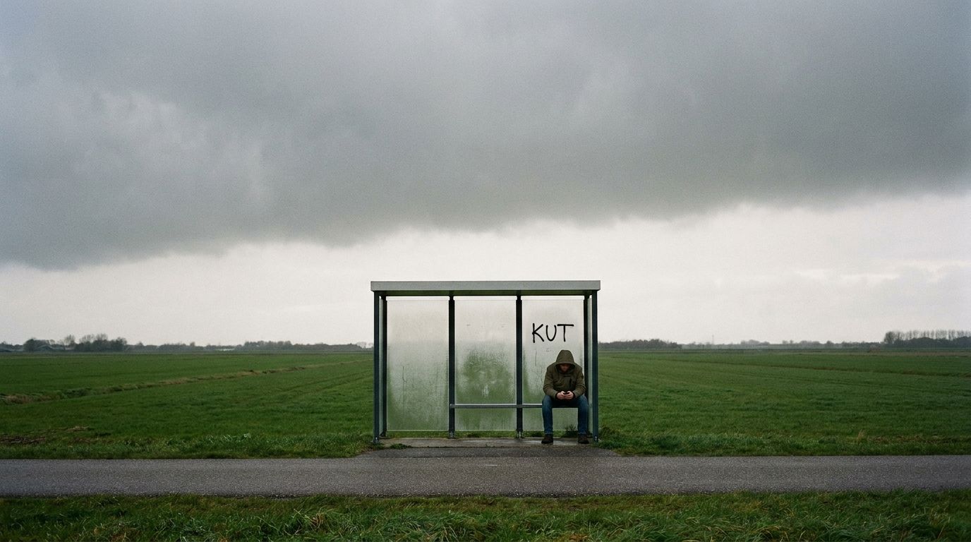
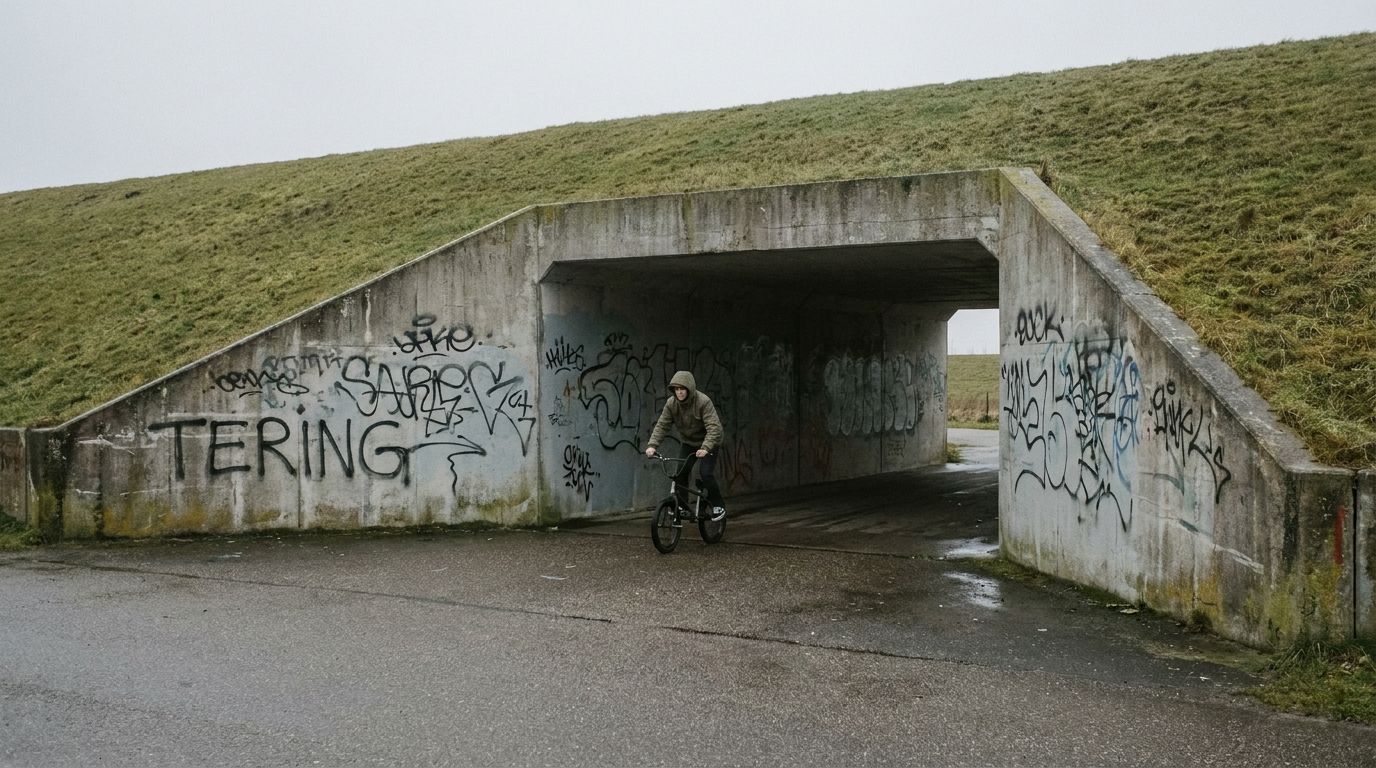
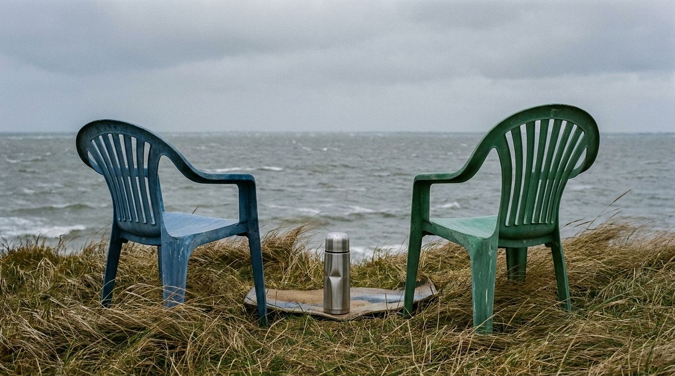
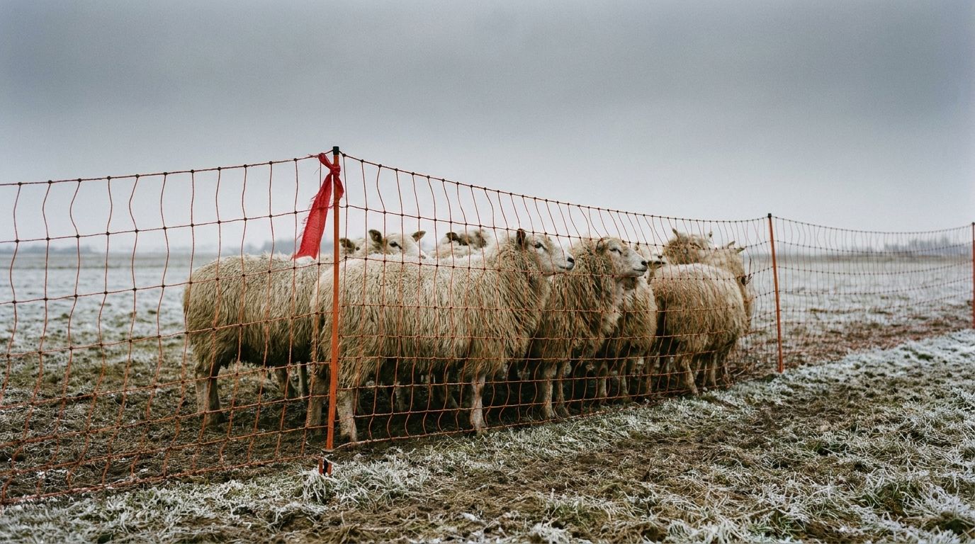
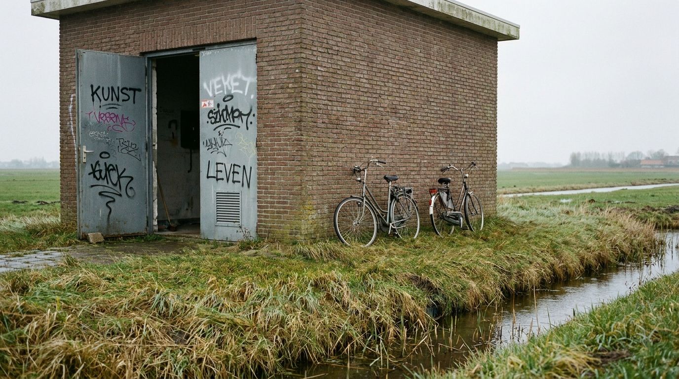
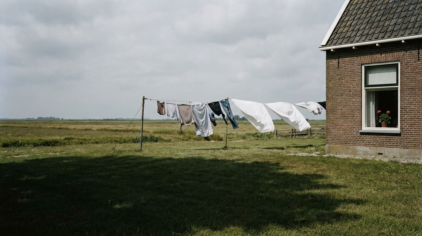
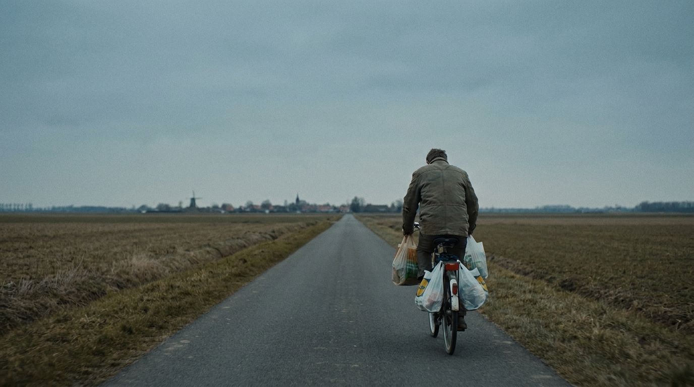
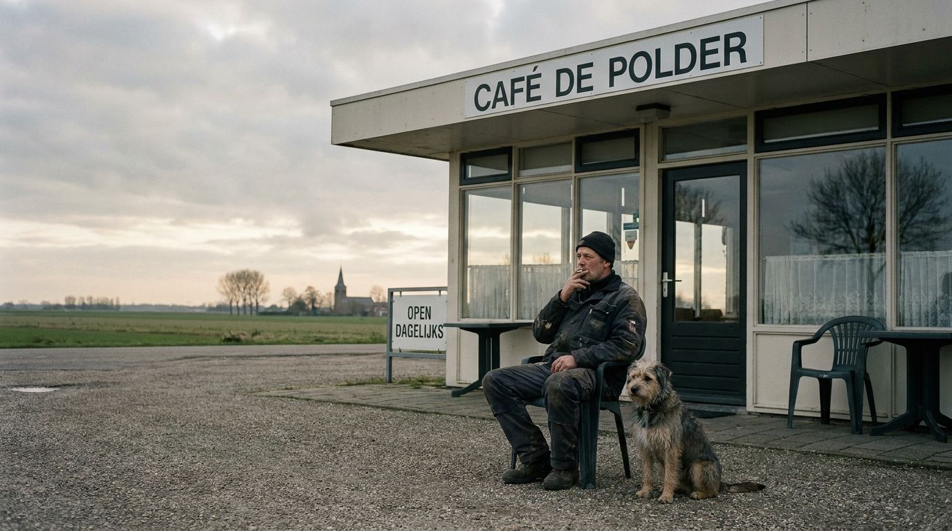
- Desaturate slightly (≈0.85–0.9) for cohesion.
- Full-bleed within the column; softly rounded corners.
- People over product; place over abstraction.
09Environment
Out in the world
The system holds at every size and on every surface: the same mark, the same restraint, from a conference display to a chest print. Nothing is redesigned per context; only scale and material change.
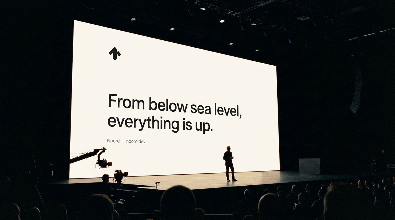 Large screens
Slides and displays carry typography and the mark only, all left aligned. One line per slide; whitespace does the rest.
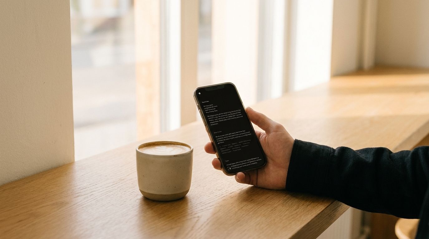 Small screens
The noord.dev homepage on the mobile grid: a single column, type stepped down, spacing held. The mark stays legible to 16px.
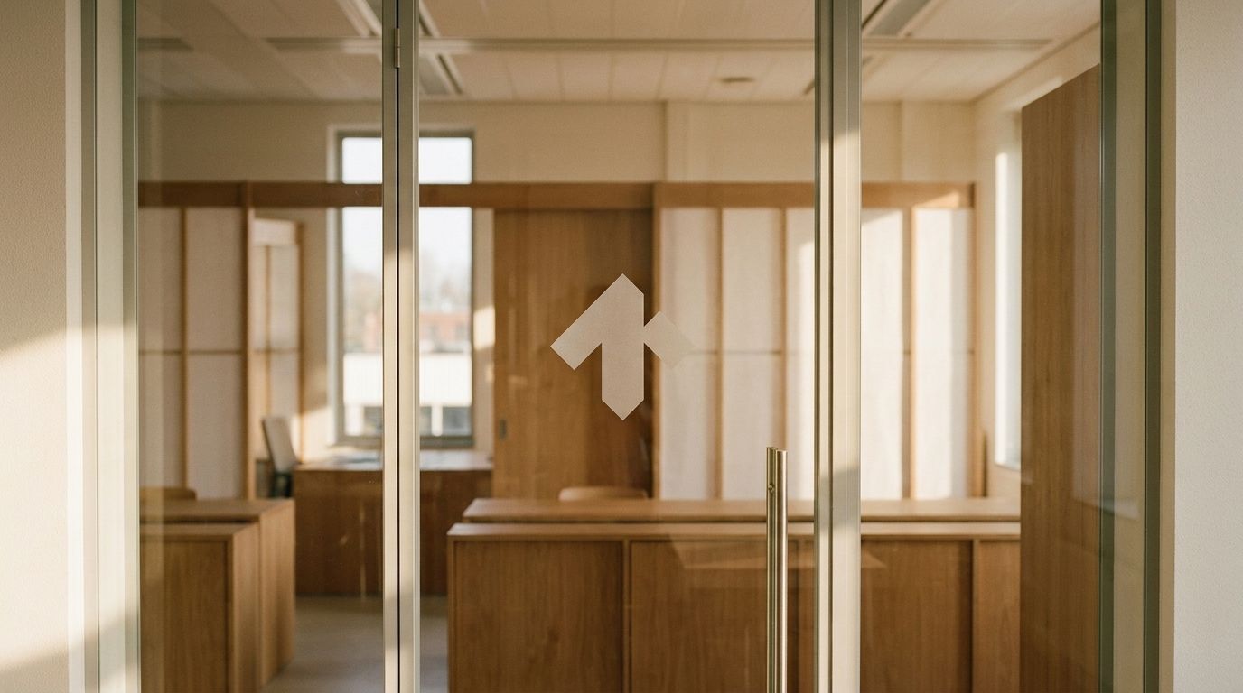 Outside
Signage is the mark and wordmark on an ink panel, or ink on paper. One material, one color, no effects; legible at distance.
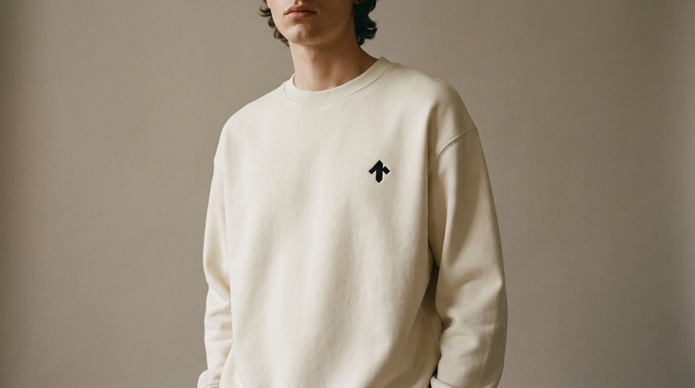 Merch
MerchEmbroidered or printed in one color: ink on light gear, bone on dark. The mark sits small on the chest, never across the back.
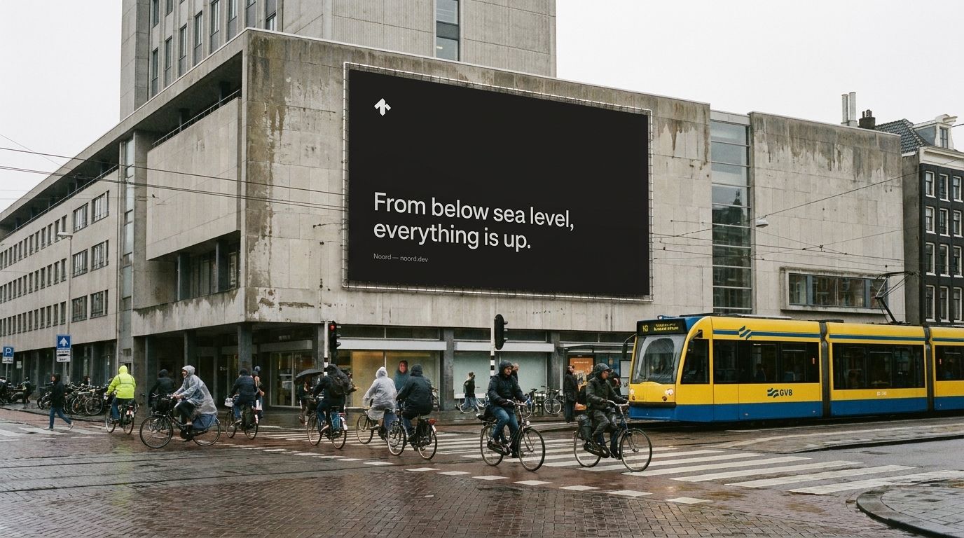 Billboards
One line, the mark, and room to breathe: the slide layout at roadside scale. If it can't be read at 80 km/h, it says too much.
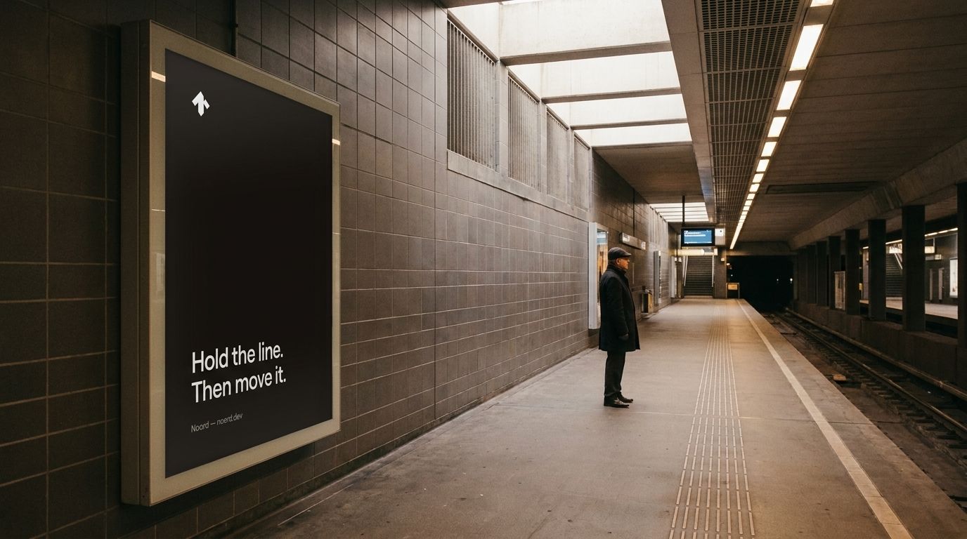 Subway ads
The portrait ad on a backlit panel: paper ground, one claim, the mark small. It competes by being the quietest thing on the platform.
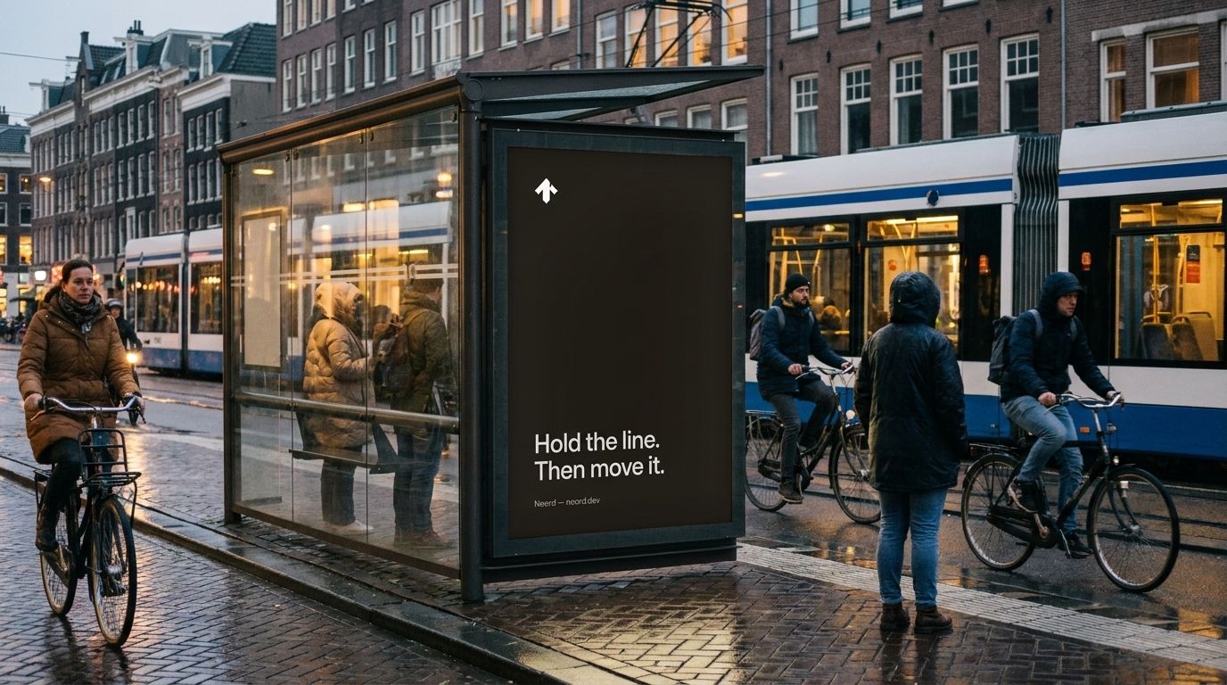 Bus stop ads
The same portrait creative in the abri frame, unchanged behind wet glass. One system, every format.
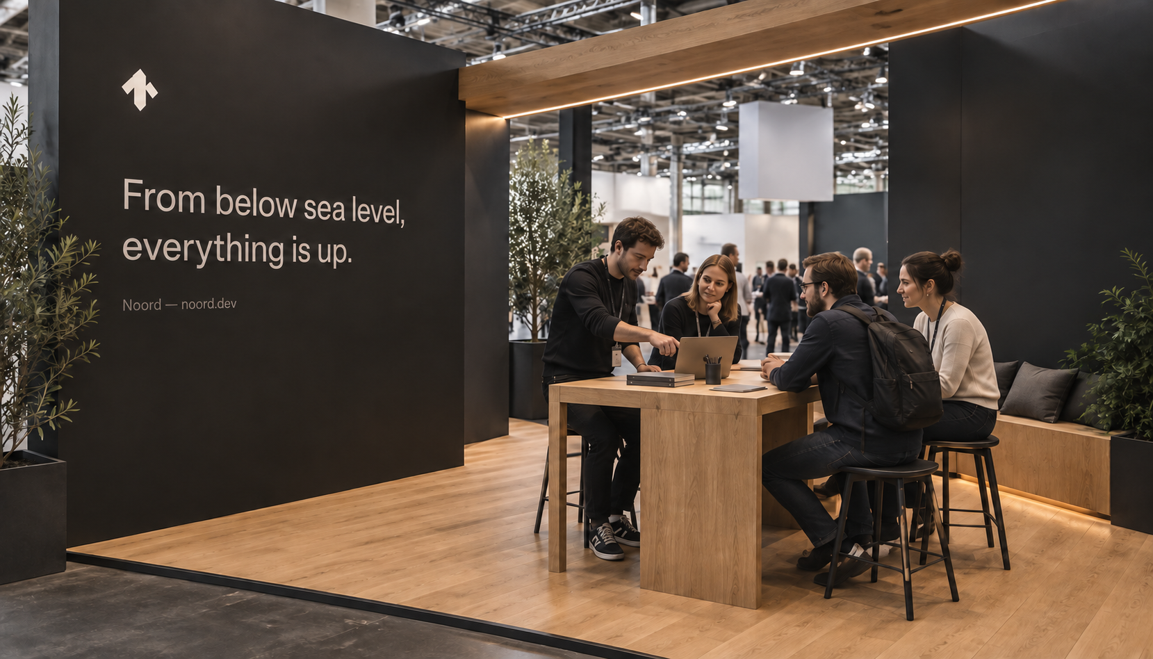 Conference presence
A room for a conversation: one headline wall, warm oak, and a shared table to try the work. The same restraint, at human scale.
10Motion
Short and eased
Motion stays out of the way. Transitions are short (0.15–0.3s) and eased. Color and opacity change; layout rarely moves. Theme switches cross-fade. Nothing bounces, nothing announces itself.
11Components
The working parts
Use Vlak components consistently. Give actions clear labels, maintain keyboard access and support light and dark themes. Links use weight and a subtle color change on hover, without underlines. Reserve interaction for useful actions.
Buttons & links
Badges
Card
Vlak
A minimal agentic design system. Reusable components and patterns for coherent interfaces.
Form
Icons
VlakThe Noord design system. Components, tokens, and interface patterns, documented at vlak.dev.
12The lab and its systems
One core brand, four sub-brands
Noord is the core brand. Vlak, Polder, Bureau and Studio are sub-brands, each with individual guidelines for its role, mark, voice and applications. They inherit Noord’s colour, typography, grid and behaviour. Use the sub-brand name in product contexts and “by Noord” when the relationship needs to be explicit.
Noordnoord.dev
Applied design lab
Core brand
Interfaces for visual model training. Expert judgment translated into working systems.
Vlakvlak.dev
Minimalist agentic design system
Noord sub-brand
Shared components, tokens and patterns. A common interface foundation.
Vlak brand guidelines →Poldernoord.dev/polder
Open models for ai-native design process
Noord sub-brand
Open methods, templates and working references. Selected P1 identity with a full-height central spine.
Polder brand guidelines →Bureaunoord.dev/bureau
Humans and agents in one place
Noord sub-brand
Shared agents in dedicated channels. User-selected models with universal instructions and memory. Keep the existing approved Bureau mark.
Bureau brand guidelines →Studio
Studio
Noord sub-brand
The fifth identity in the Noord family. Selected S mark with balanced diagonal strokes and shallow indents. Product descriptor to be defined.
Studio brand guidelines →13Do & don't
In short
- Let whitespace carry the page.
- Let weight and spacing carry emphasis.
- Write less, then cut more.
- Round corners subtly (4–6px); keep lines hairline.
- Show the work; skip the adjectives.
- Use the selected five marks in consistent order, scale and orientation.
- Use the lab signature: Applied design lab / Alkmaar, the Netherlands.
- Use actual product views and work in application examples.
- Introduce color; the system is monochrome.
- Set anything in all caps.
- Add shadows, gradients, or glow.
- Reach for hype or superlatives.
- Introduce a second typeface.
- Make motion the main event.
- Do not substitute archived logo explorations for the selected family.
- Do not change the logo orientation during motion or use one mark in place of another.
Noord brand guidelines · 2026 · Polder public reference
Leave the next person enough to work with
Write down what was decided and why, with links to the notes or examples behind it. Keep the open questions alongside the decisions. Someone joining the project should be able to tell which is which without asking you.
Project: [name]
Input sources: [references and permission]
Approved decisions: [choice, rationale, owner]
Assumptions: [what remains untested]
Open questions: [question, owner, due date]
Acceptance checks: [observable pass/fail criteria]
Next step: [person or workflow]
Approval: [name, date, version]
Before you move on
- Can someone who was not in the room understand the result?
- Are claims supported by evidence, with uncertainty labeled?
- Has the responsible person approved the decisions—not just received the document?
- Have you removed private information and checked rights to any assets?
If the summary says something was agreed and you cannot find that agreement in the notes, ask the person who decides before carrying it into the next task.