Studio Noord · Strategic research
Brand & Competitive Landscape
The brand positioning template — the full scope of a research engagement, shown on Acme, a fictional European operations-software company. Every competitor, figure, and quote in this document is invented; the structure, the maps, and the method are the real thing.
Executive summary
Acme has the rarest thing in its category: earned maturity. Twelve years, two platform generations survived, reference customers that renew without being asked, and a product its market quietly standardized on. That is reputation money cannot buy and a younger company cannot fake.
And yet the brand spends that advantage instead of compounding it. The current identity reaches for young and friendly — rounded mascots, pastel gradients, "work made delightful" — at the exact moment Acme should read as the seasoned operator in the room. The maturity is real; the brand hides it. Worse, the genuinely distinctive material — the reliability record, the operator-built origin — sits three clicks deep while the homepage leads with the one line every competitor already uses.
Three reads, and what they mean:
- The market is full of tools that "make work easier." Almost none stand for something. The brands that win anchor on a worldview buyers want to belong to, not a feature description.
- Acme's closest analog already out-narrates it. Vertex turned the same fact Acme owns — built by people who ran the floor — into a loud, memorable flag. Same truth, sharper telling.
- The fix is not to look younger or shout louder. It is to claim a worldview only Acme can credibly hold — one that converts age and restraint from a liability into the point.
Bottom line: Acme does not have a credibility problem or a reach problem — it leads its home market on both. It has a meaning problem. This document maps the landscape across five angles — positioning, brand & visual identity, SEO, AI visibility, and social — at three scales, and lands on the anchor that ties them together.
Positioning
Two things decide a brand's position in this field. Axis 1, earned maturity & reputation (track record, trust, customer goodwill). Axis 2, a distinctive, ownable brand or worldview (can the market name what you stand for?). Acme sits high on the first and mid-pack on the second. That single gap is the whole strategy.
Earned maturity (vertical) against a distinctive, ownable brand/worldview (horizontal) — a representative span of the field. Conceptual, not to scale, and every dot fictional. Acme sits high on reputation but only mid-pack on a brand the market can name — directly below Vertex, which holds the same operator-built truth with a far sharper flag.
Three scales
- Home market — Acme leads on substance, not distinctiveness. The largest reach and the deepest install base of any local player, but the most memorable local brands are smaller companies with a sharp line: Mica speaks to technical teams in their own idiom, Quartz owns "calm software," Fieldnote is a name that is a thesis. Acme out-resources them and under-positions them.
- Regional — a crowded "make work easier" middle, with a few flags above it. Vertex (the operator flag), Cobalt (owns the category's annual data narrative), Halcyon (the polished incumbent). Acme is respected but not yet in this named-brand tier.
- Global — the benchmark for what a worldview does. Atlas and Meridian do not win on "we make work easier." They win on meaning, expressed with craft. That is the bar to measure the rebrand against, not the local peers.
Brand & visual identity
The brand reads younger than the company is
This is the central tension, and it is fixable. Acme's current site is clean and not chaotic, but its tonal and visual cues — the rounded mascot, pastel gradients, "work made delightful" — signal approachable young startup, not the operator the market standardized on. For a company whose scarcest asset is earned maturity, the brand layer actively under-sells the thing that matters most.
- Maturity is invisible in the brand. The uptime record, the customers who renew for a decade, the operator-built origin — none of it is felt in the visual language. A buyer landing cold cannot tell Acme apart from a two-year-old startup.
- The distinctive material is buried. The reliability story and the founding thesis live three clicks deep; the homepage leads with the generic.
The bar to design against
The useful truth from scanning the field (the full company-by-company scan is in the next section): almost no brand in this category is genuinely design-led. The field clusters on two safe defaults — feature-grid screenshots and smiling-team photography — in neutral sans-serif. The real frontier is a handful of smaller, braver brands:
| Company | What they prove |
|---|---|
| Tessel | The high-water mark. A design-led product whose site is the argument — purely typographic, one accent color, the medium expressing the thesis. This is the ceiling. |
| Mica | Brand as audience filter: a terminal-style homepage that speaks to technical teams in their own language. Distinctiveness from a concept, not a budget. |
| Bureau | Proof an incumbent can rebrand into something ownable — a generative motif, warm palette, real art direction. The closest peer-scale precedent for the move Acme should make. |
| Fieldnote | A pure typographic declaration set with conviction. Proof that one bold statement can be the whole identity. |
| Quartz | Proof that disciplined restraint reads as premium — a quiet site where a sharp line and editorial confidence carry the brand, not loud graphics. |
The direction for Acme is not "more polish" or "look older." It is confident restraint plus one ownable idea — a visual language that carries the weight of twelve years and gives a single worldview room to breathe. Maturity, expressed as taste rather than age. Almost no one in the field has paired a distinctive worldview with genuinely distinctive craft; that is the open lane.
The field, company by company
A firsthand scan of the brands Acme is measured against — regional, global, and the home market. Taglines are representative of each brand's register (and, like the companies, invented); the design score is an opinionated 1–5 (5 = reference-grade). The pattern is consistent: visual sameness is the rule, and the strongest brands win on a sharp verbal idea, not graphics.
Regional
| Company | Tagline | Visual style & tone | Design |
|---|---|---|---|
| Vertex | "Built by the people who ran the floor." | High-contrast type, documentary photography of real operations. The sharpest verbal flag in the field. | 3.5 |
| Halcyon | "The operations platform for teams that scale." | Polished gradient-corporate; safe, expensive-looking, anonymous. | 3 |
| Cobalt | "The state of operations, measured." | Data-led editorial; owns the category's annual report narrative. | 3 |
| Northgate | "Everything your team runs on." | Feature-grid template, blue accent. Comprehensive, forgettable. | 2 |
| Arden | "Software with manners." | Soft serif headlines, illustration-led warmth. Charming, small. | 2.5 |
Global majors
| Company | Tagline | Visual style & tone | Design |
|---|---|---|---|
| Atlas | "The work behind the work." | An ownable illustration system plus a full media operation. The owned-media benchmark. | 4.5 |
| Meridian | "Where operations think." | Editorial, monumental type, moody and premium. Aspirational, conviction-led. | 4 |
| Ledger & Lane | "Trusted since before the cloud." | Institutional monochrome; heritage as the argument, dusty in places. | 2.5 |
| Grove | "Simple tools for serious teams." | Minimalist black/white, templated. The verbal hook beats the visual. | 2.5 |
The home market
| Company | Tagline | Visual style & tone | Design |
|---|---|---|---|
| Mica | "$ acme --for-engineers" | Terminal-style homepage; brand as audience filter. Concept over budget. | 3.5 |
| Quartz | "Calm software." | Quiet premium restraint; two words doing all the work. | 3 |
| Fieldnote | "Write it down once." | A typographic declaration; the name is the thesis. | 3 |
| Lumen Works | "Operations, illuminated." | Stock-photo corporate; earnest, dated. | 1.5 |
What the scan says
- Two safe defaults own the category: feature-grid screenshots and smiling-team photography. Neutral palette, one accent, clean sans-serif, over and over.
- Differentiation today is verbal, not visual. The memorable brands win on one device — "built by the people who ran the floor," "calm software" — not on graphics. Which is precisely the opening: with the entire field clustered on safe, templated visuals, a genuinely distinctive identity would stand out instantly.
- The open lane for Acme: pair a distinctive worldview with genuinely distinctive craft. Almost no one in this field has done both, and Acme has the reputation to make it credible.
SEO & findability
Acme's content is a genuine asset that is scattered, and partly stale — which dilutes both search authority and the signal AI assistants pick up.
- Authority split across two homes. An on-site blog and a separate publication divide the link equity; the on-site index has broken paths. Pick one home and consolidate.
- Real keyword assets exist but stand alone. One buyer's guide ranks and converts; the rest of the content has no thematic hub tying it to the positioning.
- No flagship content engine. The brands that dominate findability own a recurring, citable artifact — an annual report, a benchmark, a playbook. Acme has the raw expertise to own one; the category's operations benchmark is comparatively unclaimed.
→ The move: consolidate to one content home, repair the index, build a theme hub for the positioning, and commit to one flagship recurring artifact rather than a scattered cadence.
AI search visibility
Buyers increasingly vet vendors the way they vet everything else now — they ask an AI assistant "what's the best operations platform for a team like ours?" and act on the named answer. For a company whose pipeline runs on reputation, being named in that answer is the new word-of-mouth.
Where Acme stands
- Strong for home-market queries. High-authority local citations and clean structured-data coverage — the sources models lean on.
- Weaker regionally. Several "best platforms" round-ups surface without Acme; for a broad regional prompt, Vertex and Cobalt are more likely to be named because they carry more editorial density.
- A real, funded category now optimizes for this. Generative-engine-optimization tooling exists precisely to monitor and improve how brands appear in AI answers. This category is early there — an opening.
Why the anchor matters here too
Language models reward brands described in consistent, specific language across the web. A vague "friendly operations platform" gets averaged into the noise of a hundred identical tools. A sharp, repeated worldview gives third parties — and the model — a crisp phrase to attach to Acme. A distinctive anchor is not just a brand asset; it is an AI-visibility asset.
Social media
On reach, Acme leads its home market — but step out regionally and it inverts: Acme sits near the bottom of the wider table, and the gap tracks one thing almost exactly — owning a flagship content asset, which Acme does not have.
Social following, home-market field (June 2026, invented figures, ±10% register). Acme leads its local peers.
Zoom out — the regional & global field
Among the wider set, reach scales with a signature owned-media engine. Acme's ~14.5k trails every named brand below, and the ones far ahead nearly all own a flagship:
| Company | Following (est.) | Flagship content engine |
|---|---|---|
| Atlas | ~640k | A full in-house media network — essays, podcasts, video |
| Meridian | ~310k | Annual benchmark + editorial program |
| Cobalt | ~120k | "State of Operations" — owns the category's data narrative |
| Halcyon | ~85k | Customer-story machine |
| Vertex | ~34k | Founder-led essays with a sharp flag |
| Grove | ~22k | Playbooks + templates library |
| Acme | ~14.5k | None yet — the gap |
| Tessel | ~6k | One annual essay, read far beyond its following |
Invented figures; the point is the pattern, not the decimals.
- Reach follows a flagship, not a posting cadence. Tessel has ~6k followers and outsized influence off one annual essay; Cobalt owns the data narrative. Acme has genuine reach and no signature asset to compound it.
- One healthy channel; the rest is thin. The footprint is concentrated by default, not by strategy.
- Acme's move is not "post more" — it is to own one flagship, pair it with a sharp anchor, and let the reach compound into recognition.
Earned reputation
The proof Acme already owns
The anchor (next) is not invented from nothing — it must be entitled by real evidence. Acme's is unusually strong, and most of it is structural, which makes it hard to fake and easy to defend.
- The renewal record. Customers that have renewed for a decade — the most credible endorsement that exists, and it is structural, not testimonial.
- Operator-built origin. The founding team ran the operations they now build software for. Rare, and rarely told.
- A stated ethos of restraint. The product famously ships less, better — a humility the category doesn't have.
- Full-circle stories. Customers who left for a competitor and came back; employees who became customers and vice versa. The most resonant proof of alignment.
Read: these are proof assets, not the anchor itself. "Reliable" and "we've been around" are credibility hygiene every vendor claims. The work is to convert this proof into a worldview only Acme can credibly hold.
The missing layer
From "we make work easier" to a worldview
The strongest brands in any field do not describe a service; they fly a flag. The pattern, across every benchmark, is the same: a worldview with an implied enemy, that selects the right customers, and is lived in content and design rather than merely stated.
Thesis → worldview → aesthetic. A thesis dates as markets rotate; an aesthetic needs a star to carry it. The durable center — a worldview — is where the magnetic brands live, and where Acme should aim.
What makes an anchor work
- It has an implied enemy. Vertex vs. tourists who never ran the floor; Quartz's calm vs. the attention economy. Friction makes a flag.
- It selects. A real worldview repels the wrong customers on purpose. "We make work easier" selects no one — and is invisible in an AI answer.
- It is lived. The marker must generate artifacts — a benchmark, an essay series, a program — or it is a poster, not a position.
Candidate anchors for Acme
Each is rooted in Acme's real proof, emotionally resonant, and goes beyond "reliable / we've been around." The twelve years and the renewal record are the proof that entitles the claim, not the slogan itself.
| Direction | The worldview | Why only Acme |
|---|---|---|
| "The software your software relies on" — the substrate | Acme is the layer everything else assumes is there — infrastructure loyalty, not app-of-the-month. Enemy: disposable tooling. | The market literally standardized on it; a decade of renewals is the receipt. Turns "old" into load-bearing. |
| "Built by the floor, for the floor" — operator origin | Made by people who ran the work, so it respects the work. Enemy: software designed in a slide deck. | The founding story is real and documented — but Vertex flies a nearby flag, so this lane must be sharpened, not shared. |
| "Calm at scale" — restraint as a feature | The tool that ships less, better — software that lowers the temperature of work. Enemy: the notification economy. | The product ethos already is this; the brand has simply never said it. Converts restraint from blandness into a stance. |
| "The long game" — endurance as courage | Built for the customers still here in ten years. Enemy: churn-and-burn growth. | Only a company with Acme's record can claim it without laughing. Reframes age as nerve. |
Our read: lead with the substrate — "the software your software relies on." It is the most ownable thing Acme has (the standardization is literal), the most emotionally magnetic — belonging to the layer that holds everything up — and it converts Acme's maturity into proof of load-bearing trust rather than evidence of age. Give it warmth with the operator-origin story. The exact words are the workshop's job; the territory is trust, weight, and quiet indispensability.
A bold direction
A territory worth exploring: engineered calm
If Acme wants to genuinely stand out, here is one direction the field leaves wide open. The category photographs screenshots and smiling teams; nobody photographs the thing the software actually protects — the calm of a system that holds. There is a visual language for that: wide, level, engineered landscapes; infrastructure doing its job in silence; weather passing over something built to outlast it.
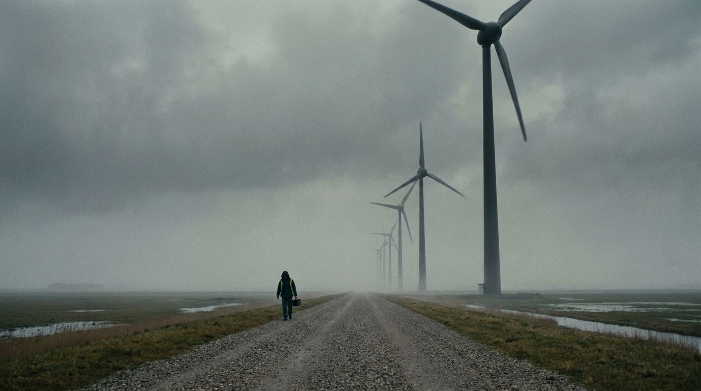
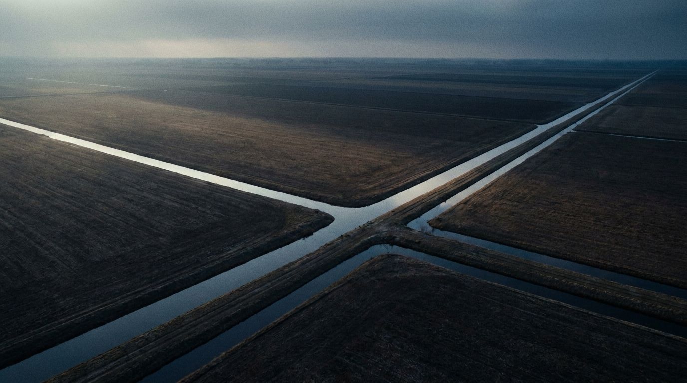
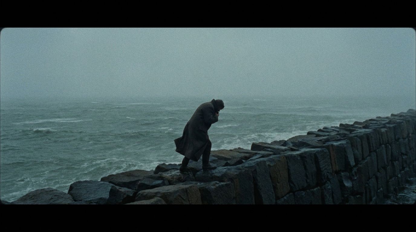
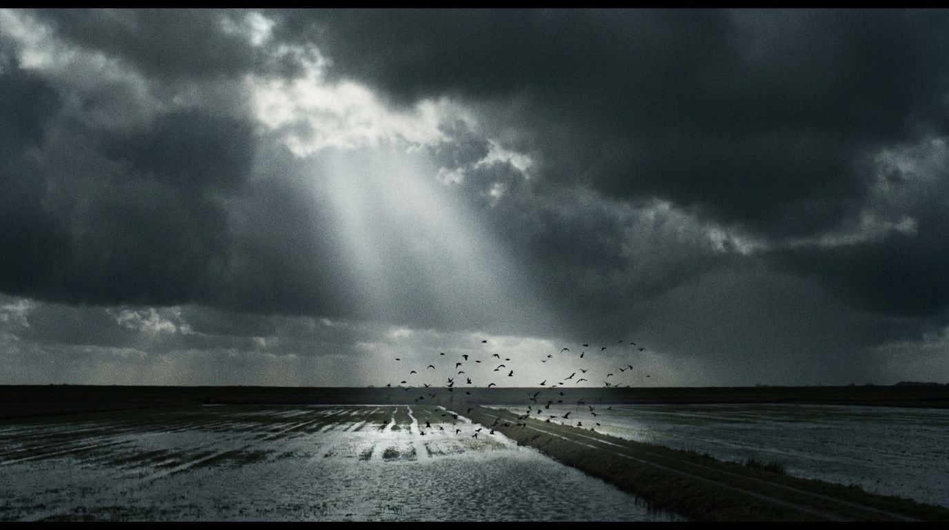
The move is not landscape-as-decoration. It is engineered-calm atmosphere cut against modern typography — the quiet, load-bearing imagery set beside a clean contemporary grotesque and a dry sense of humour. That tension is what would make it feel new rather than corporate-serene, and genuinely distinctive in a category of look-alike screenshots. One direction among several for the workshop, but a bold one.
What this means
Every finding points the same way — Acme has the substance and the reach; what is missing is meaning and the discipline to express it.
| Finding | The move |
|---|---|
| Earned maturity is real but invisible in the brand | A visual identity of confident restraint — benchmark the design frontier, not the templated middle |
| Brand reads "young/friendly"; distinctive material buried | Promote the substrate story to the brand surface |
| No ownable worldview; "we make work easier" is invisible | Claim the anchor — "the software your software relies on" |
| Content scattered, index broken, no flagship | Consolidate to one home; build a theme hub + one recurring flagship artifact |
| Strong AI visibility at home, thin regionally | Consistent worldview language across editorial; lift regional density |
| Reach leads locally but spread thinly across channels | Commit to one lane that expresses the worldview |
The leaders in this landscape do not win with better feature lists — they win with a clearer worldview, expressed with craft. Acme already has the rarest inputs: a real track record, genuine customer goodwill, and the reach to carry a message. What is missing is the message itself. That is exactly what the brand foundation work sets out to settle.
Sources & reliability
Method: in a real engagement this section lists every source consulted — live-site audits, structured databases, rankings, editorial coverage — with links, dates, and reliability flags. Interpretive reads are labeled as such; figures are point-in-time and flagged where third-party or unverified.
Flagged as estimate [EST]: all follower counts and market figures carry the estimate flag with a stated tolerance (here ±10%) and collection date.
This document: the template. Every company, figure, tagline, and quote is invented; nothing here describes a real market. The structure — five angles, three scales, proof before anchor, sources last — is the deliverable.
© 2026 Studio Noord